Snippets (Interior Page)
Snippets are reusable content blocks that can be added to pages.
They can be used on both Landing Pages and Interior Pages. Unlike Assets, each Snippet is configurable and unique to the page where it’s placed. Below are visual examples of some of the most commonly used Snippets in the CMS for Interior Pages. Tutorials on how to configure and use each Snippet are linked through the red buttons.
Be sure to read the Getting Started page to see where to find the Snippet option in the MC Editor. (Hint- Its the puzzle piece icon next to the "< >" button.)
Table of Contents:
Int = Interior page | LP = Landing page
Main Content Snippets found on both Interior and Landing Pages
- Accordion ( LP )
- Button ( LP )
- Card – Call to Action ( LP )
- Card – General ( LP )
- Card – People ( LP )
- Card – Program ( LP )
- Stats – Feature ( LP )
- Responsive Table ( LP )
Main Content Snippets found on both Interior and Landing Pages
Accordion Snippet
Select: Interior Page in drop down, see "Accordion-Interior Page"
Below is an Interior Page-specific Accordion Snippet. Expandable content sections that keep long text organized and easy to browse.
The First actual "Section" - Read Me?
View Instructions
Button Snippet
Select: General in drop down, see "Button"
A clickable element that directs users to another page, section, or action — often used to highlight calls to action (CTAs) like “Apply Now,” “Request Info,” or “Donate.”
View Instructions
Card – Call to Action
Select: Cards in drop down, see "Cards- Call to Action"
An easy to configure call-to-action card for content creators to drive user engagement and highlight key actions across the website.
CTA Card Heading
Lorem ipsum dolor sit amet, consectetur adipiscing elit, sed do eiusmod tempor incididunt ut labore et dolore magna aliqua. Ut enim ad minim veniam, quis nostrud exercitation ullamco laboris nisi ut aliquip ex ea commodo consequat.
Card - General Snippet
Select: Cards in drop down, see "Cards- General"
A General Card displays clickable links in a clean card format with an image, title, and description. Great for drawing attention to key content, such as services, events, articles, or any featured content.
Optional subtitle text above main heading
General Card Snippet- Horizontal
Lorem ipsum dolor sit amet, consectetur adipiscing elit, sed do eiusmod tempor incididunt ut labore et dolore magna aliqua. Ut enim ad minim veniam, quis nostrud exercitation ullamco laboris nisi ut aliquip ex ea commodo consequat.
Card - People Snippet
Select: Cards in drop down, see "Cards- People"
Organizes faculty information in a “business card” style layout, complete with a profile image and contact details.

Card - Program Snippet
Select: Cards in drop down, see "Cards- Program"
Lists multiple programs within a rounded, grouped layout—ideal for showcasing offerings at a glance.
Program Card Heading Level (Heading Level Three)
Lorem ipsum dolor sit amet, consectetur adipiscing elit, sed do eiusmod tempor incididunt ut labore et dolore magna aliqua. Ut enim ad minim veniam, quis nostrud exercitation ullamco laboris nisi ut aliquip ex ea commodo consequat.
Stats – Feature Snippet
Select: General in drop down, see "Stats - Feature"
Displays key statistics and information about an organization, service, or team in a visually engaging format.
Left 3 Items
Lorem ipsum dolor sit amet, consectetur adipiscing elit, sed do eiusmod tempor incididunt ut labore et dolore magna aliqua.
- 99item 1
- 99item 2
- 99item 3
Right 3 Items
Lorem ipsum dolor sit amet, consectetur adipiscing elit, sed do eiusmod tempor incididunt ut labore et dolore magna aliqua.
- 99item 1
- 99item 2
- 99item 3
Responsive Table
Select: General in drop down, see "Responsive Table"
Displays table data.
| # | Heading | Heading | Heading | Heading | Heading | Heading | Heading | Heading | Heading |
|---|---|---|---|---|---|---|---|---|---|
| 1 | Cell | Cell | Cell | Cell | Cell | Cell | Cell | Cell | Cell |
| 2 | Cell | Cell | Cell | Cell | Cell | Cell | Cell | Cell | Cell |
| 3 | Cell | Cell | Cell | Cell | Cell | Cell | Cell | Cell | Cell |
Main Content Snippets for Interior Pages
Interior Page SPIFFs Bank Snippet
Select: Interior Page in drop down, see "Interior Page SPIFFs Bank Snippet"
The SPIFFs Bank Snippet is a reusable library of pre-designed content blocks (known as "spiffs") that can be inserted into interior pages to enhance layout, highlight content, or add functionality without custom coding.

A Special Interest Story
A story about tulips and how their image has been cropped over the years. When you refresh your browser, the SPIFF Bank displays one of the items created in this Bank. There are only 4 here, so be patient if you have to refresh a few times to see something different - there is not much to randomize in a set of 4!
Interior SPIFFs Bank Row Snippet
Select: Interior Page in drop down, see "Interior Page SPIFFs Bank Row Snippet"
The Interior SPIFFs Bank Row Snippet is a layout Component that allows you to display a horizontal row of SPIFFs (pre-designed content blocks) on an interior page. These rows can include items like program highlights, services, quick links, or calls to action — all styled consistently.
Sample SPIFF

Nulla facilisi. Nulla vitae tortor non nisl consequat semper at at arcu. Quisque viverra quam id magna luctus porttitor.
Sample SPIFF
Nulla facilisi. Nulla vitae tortor non nisl consequat semper at at arcu. Quisque viverra quam id magna luctus porttitor.
Sample SPIFF
Nulla facilisi. Nulla vitae tortor non nisl consequat semper at at arcu. Quisque viverra quam id magna luctus porttitor.
Sample SPIFF
Nulla facilisi. Nulla vitae tortor non nisl consequat semper at at arcu. Quisque viverra quam id magna luctus porttitor.
Sidebar Snippets for Interior Page
These are Snippets that go in the "Left Sidebar Content" or "Right Sidebar Content" sections.
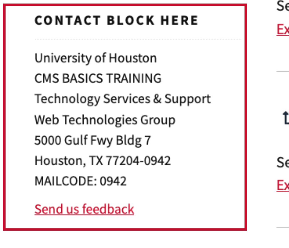
Contact Block Snippet
Select: Interior Page in drop down, see "Contact Block"
Displays contact details encouraging users to get in touch.
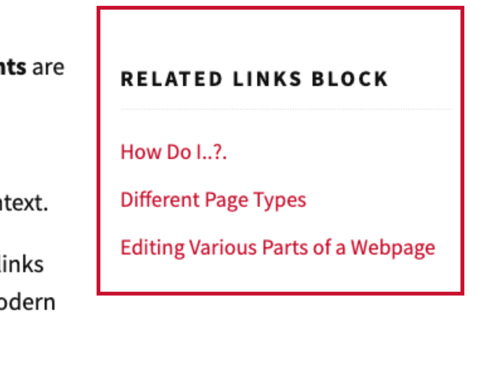
Related Links Snippet
Select: Interior Page in drop down, see "Related Links"
Suggests other pages or blog posts connected to the topic being viewed.