Snippets instructional guide
Snippets are pre-built content patterns you can drop into a page to maintain a consistent look and feel. Check out how some of the Snippets available to editors on Landing pages or Interior pages look. Please click a link below to see how to insert them into your content.
How to Insert a Snippet (start here ℹ️)- Basics (low-risk, common Snippets)
- Intermediate (structured content + dynamic blocks)
- Advanced (requires decisions or more context)
How to Insert a Snippet
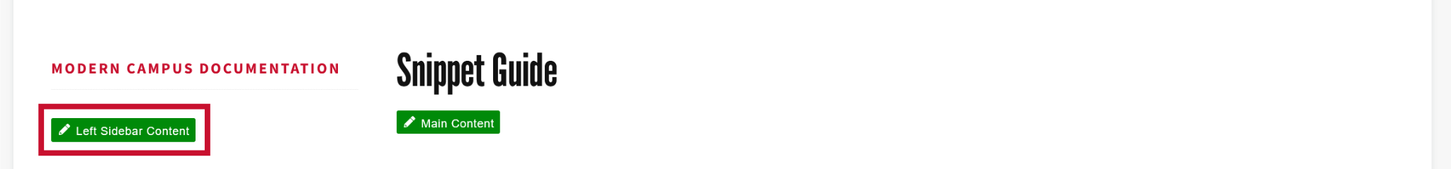
Open the Snippet Tool: In Modern Campus, choose the page (a .pcf file) that you want to edit. In the Edit tab, click the green button of your choosing to begin editing. You can choose from 'Left Sidebar Content’, ‘Right Sidebar Content’ or, most commonly, Main Content’. Locate the Snippet icon in the taskbar or WYSIWYG toolbar and click it.

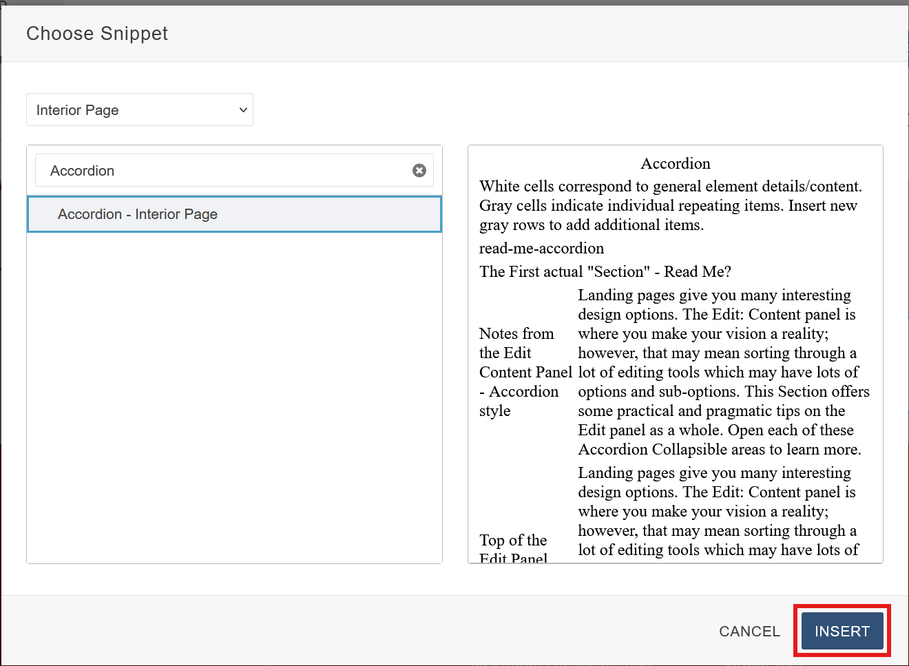
(Optional) Select the Snippet Category: Click the drop-down arrow in the top-left corner of the Snippets tab and choose a Snippet category (ie: Interior). By default, all Snippet categories are selected making this step optional, but it is helpful in narrowing which Snippets to select from.
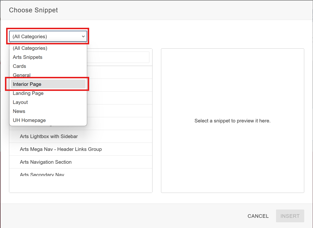
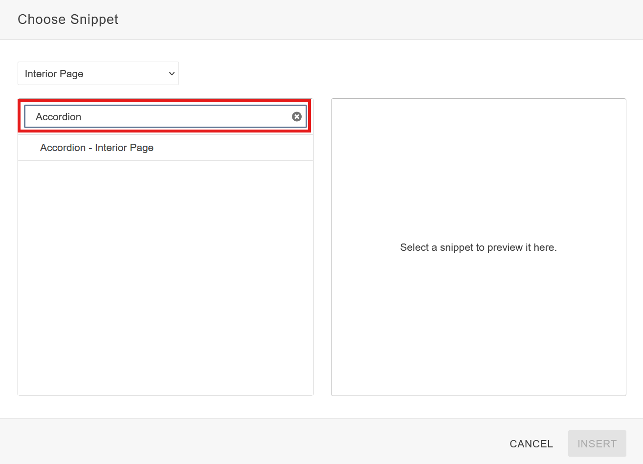
(Optional) Search Bar Filter: You may also use the search bar filter to search for a Snippet specifically. This can be used with a category filter to further narrow down results.
Insert Snippet: Once you have selected your Snippet, click the blue insert button to drop it in.
Once the Snippet is inserted, a table editor will pop up with each field playing a role in customizing the Snippet. For more information on how to use the table editor click here (link to table editor how to.)
How to Insert a Button Snippet
What this is: A clickable element that directs users to another page, section, or action.
When to use: Important links, Links to downloadable content (PDF’s, Documents), Call to Actions
(“Apply Now”, “Donate”)
Select Button from the Snippet select menu.
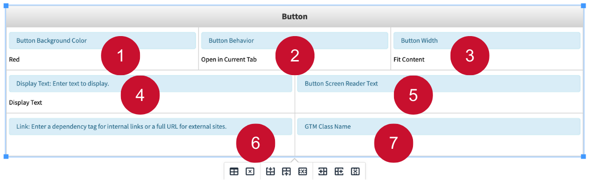
Table Editor Fields:
- Button Background Color: Sets the background color of the button. Options include Red, Light Gray, White, and Clear (no background color). The button text color will change on its own based on the background color to ensure readability.
- Button Behavior: Determines if the button will open in a current tab, or a new tab. The “download in new tab” behaves the exact same as “opens in new tab” option and is intended for downloadable files.
- Button Width: Determines the width of the button. “Fit Content” sets the width of the button to match the amount of content that is within it. “Fill Space” makes the button stretch to be as wide as the area its placed on.
- Display Text: The text that is displayed on the button. Must have something in this field, or the button will not render.
- Button Screen Reader Text: An optional field that can be used to provide additional context to screen readers to improve accessibility. Recommended to add if you are knowledgeable on accessibility standards for screen reader text.
- Link: Set the link of the button. Must have something in this field, or the button will not render.
- GTM Class Name: An optional field used for tracking in Google Analytics. It doesn’t affect how the Snippet looks. Recommended to add if you know the right name to use.
How to Insert a Related Link Snippet - Sidebar Snippet
What this is: A Related Link Snippet highlights other pages, posts, or resources connected to the
current topic.
When to use:
• To guide visitors to related articles or further reading.
• To link to admissions, curriculum, or faculty profiles.
• To connect users to policies, guides, or external websites.
Click the green 'Left Sidebar Content' button to begin editing. (If you want this to be on the right of your Interior Page then click the green ‘Right Sidebar Content’ button if you have Right Sidebar enabled in the Properties settings of the page you’re editing.)
Select Related Links from the Snippet select menu.
The Snippet is now inserted in the Edit section and ready to use. You will follow the gray instructions in the Snippet window to select the look and edit what content goes inside.

Table Editor Fields:
- Heading Text: Enter the title for your Link section. Styling such as font and size is pre-set.
- Content Box: Add the bulleted list of links you want to display.
Replace the links. See ‘Inserting and Editing Links’ in Getting Started Guide.
How to Insert a Contact Block Snippet - Sidebar Snippet
What this is: A Contact Block Snippet provides visitors with quick access to important contact
information, such as office location, phone number, email, and office hours.
When to use:
• To display department or office contact details
• To feature a faculty or staff member’s contact information
• To provide a clear point of contact for services, programs, or events
Click the green 'Left Sidebar Content' button to begin editing.
Select Contact Block Snippet from the Snippet select menu.

The Snippet is now inserted in the Edit section and ready to use. You will follow the gray instructions in the Snippet window to select the look and edit what content goes inside.
Editing the Table Fields
- Heading Text: Add a title for the section (e.g., Contact Us, Program Office, Faculty Advisor). Styling is pre-set.
- Content Box: Add all the necessary contact information in this section like: Name/Title, Phone number, Email address, Office location etc.
Replace the links. See ‘Inserting and Editing Links’ in Getting Started Guide
How to Insert a Responsive Table Snippet
What this is: A table designed to automatically adjust its layout for optimal viewing on desktops,
tablets, and mobile devices.
When to use: Displaying structured information clearly — such as course listings, comparison data,
fees, deadlines, or staff directories.
Select Responsive Table from the Snippet select menu.
Unlike other Snippets, the responsive Snippet table editor is just a standard table. Each cell can be modified and replaced with any text value.
Modify the table by adding or removing columns or rows as needed, using the Snippet table editor buttons:
Delete columns and rows by selecting the corresponding column or row and using the respective delete table editor button:
For additional information on adding and removing rows and columns, See instructions in Table Editor Guide.
How to Insert a Card - General Snippet
What this is: A clickable link displayed in a clean card format with an image, title, and description.
When to use: Links to events, services, articles or any featured content.
Select Card - General from the Snippet select menu.


Table Editor Fields:
- Add Space After: Adds a space below the card on the page. If you choose 'Yes', it adds some space (like a gap). If you choose 'No', there's no extra space.
- Orientation: Choose whether the card is shown horizontally or vertically. The layout changes, but the content stays the same.
- Background: Choose the card's background color—either gray or white.
- Image: Choose an image for the card. If you don’t pick one, a default image is used.
- Link: Set the link for the card. Must have something in this field, or the card will not render.
- GTM Class Name: An optional field used for tracking in Google Analytics. It doesn’t affect how the Snippet looks. Recommended to add if you know the right name to use.
- Title: Sets the title of the general card to be displayed. Must have something in this field, or the card will not render.
- Subtitle: Optional field that renders a subtitle above the title.
- Description: Adds a description to the card. Can be left blank.
- Tags: An optional field that lets you show up to three tags, rendered on the bottom of the card.
To create another tag, add a new instance of the tags row at the bottom of the table editor:

To remove a tag, delete its corresponding row:

For additional information on adding and removing rows, See 'Rows' instructions in Table Editor Guide.
How to Insert a Card - People Snippet
What this is: Organizes faculty information in a “business card” style layout, complete with a
profile image and contact details.
When to use: Representing individual staff or faculty information.
Select Card - People from the Snippet select menu.


Table Editor Fields:
- Add Space After: Adds a space below the card on the page. If you choose 'Yes', it adds some space (like a gap). If you choose 'No', there's no extra space.
- Image: Choose an image for the card. If you don’t pick one, a default image is used.
- Size: Sets the size of image to either small or large.
- Name: Enter the individual's name. Must have something in this field, or the card will not render.
- Bio Link: Optional field which sets the link for a user bio button. The button behavior and style are automatically adjusted based on the link being internal or external. LinkedIn links have a special style which shows the LinkedIn logo.
- Email: Optional field which sets the email address to be displayed.
- Phone: Optional field which sets the phone number to be displayed.
- Organization Name: Optional field which sets the individuals organization affiliation. "Organization" is a broad term that can refer to a division, department, program, or any other relevant grouping.
- Title: Sets the individual's job title or rank. Can have up to a maximum of 3, with at least 1 being required for the card to render.
- Tags: An optional field that lets you show up to three tags, rendered on the bottom of the card.
To create another instance of a Title or Tag to the people card, add a new row to the bottom of the table editor.

Although they share the same row, title and tags are their own fields. If you like a new instance of just a title or just a tag, simply create the new row but only fill out the field you would like.
To delete an instance of both a title and tag, you can remove the entire row.
For additional information on adding and removing rows, See 'Rows' instructions in Table Editor Guide.
How to Insert a Card - Program Snippet
What this is: Lists multiple programs within a rounded, grouped card layout.
When to use: Links to programs and offerings within the University of Houston.
Select Card - Program from the Snippet select menu.
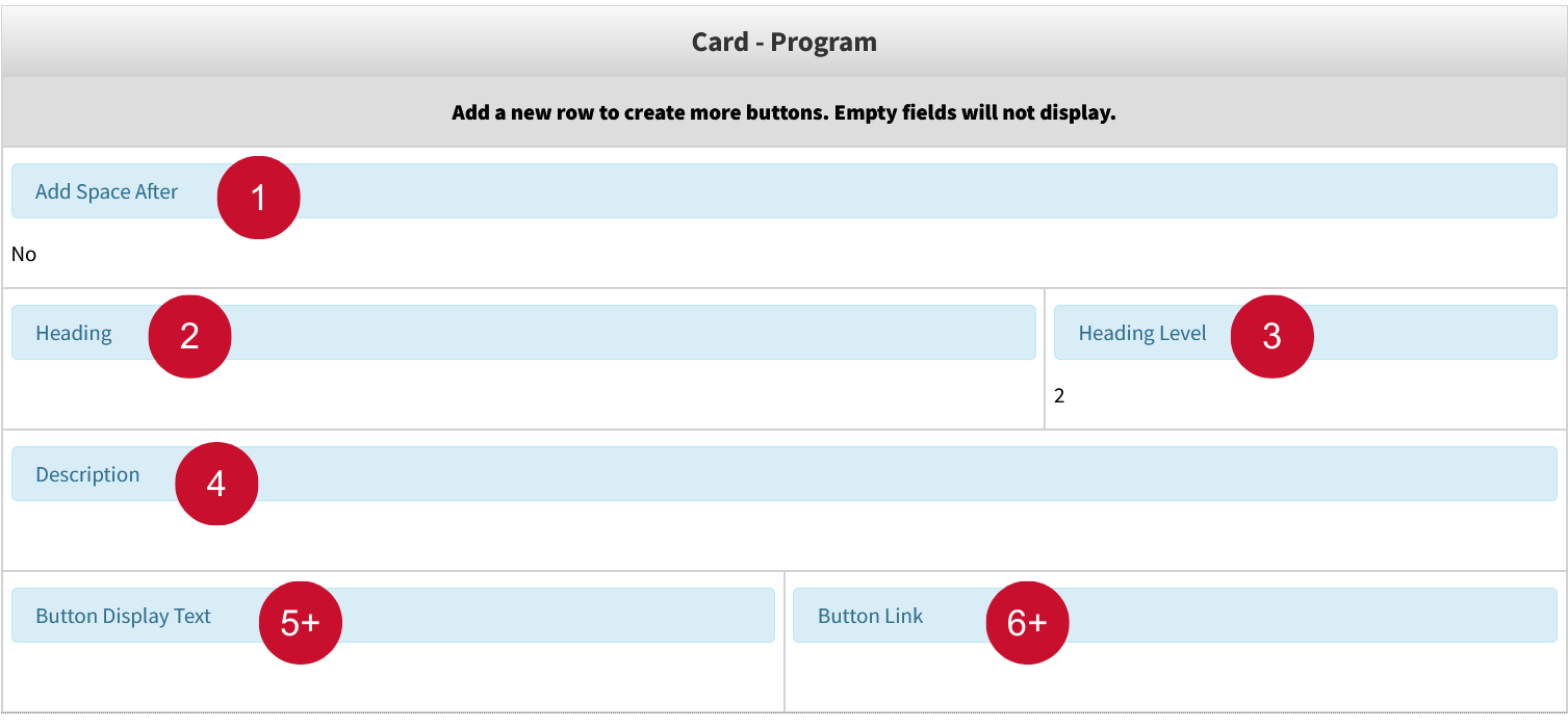
Table Editor Fields:
- Add Space After: Adds a space below the card on the page. If you choose 'Yes', it adds some space (like a gap). If you choose 'No', there's no extra space.
- Heading: Sets the heading of the program card to be displayed. Must have something in this field, or the card will not render.
- Heading Level: Sets the heading level to either 2 or 3. Visually, it determines the headings size.
- Description: Adds a description to the card. Must have something in this field, or the card will
not render.
The following fields make up one button inside the program card. - Button Display Text: The text on the button.
- Button Link: Where the button links to.
Both the Button Display Text and Button Link fields must be filled in order for the button to render. See ‘Inserting and Editing Links’ in Getting Started Guide.
At least one button is required for the card to show. There is no limit to the number of buttons a program card can have.
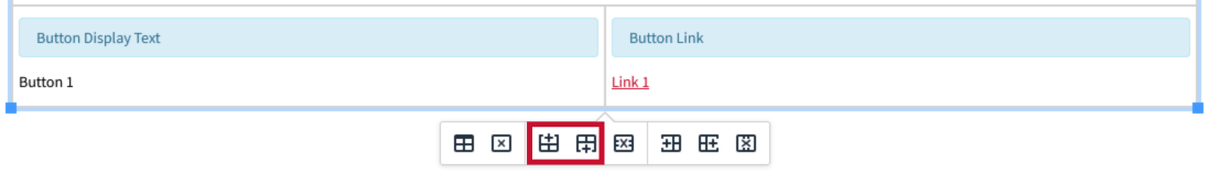
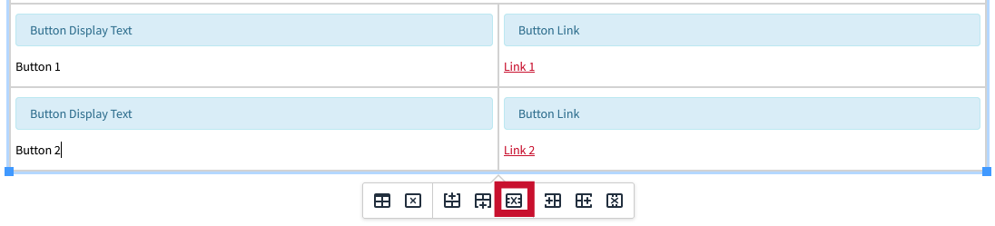
To create another button, add a new instance of the buttons row at the bottom of the table editor:
To remove a button, delete its corresponding row:
For additional information on adding and removing rows, See 'Rows' instructions in Table Editor Guide.
How to Insert an Accordion Snippet
What this is: An interactive element that shows and hides WYSIWYG content on the page.
When to use: FAQs (Frequently Asked Questions), Step-by-Step Instructions or Tutorials, Course
or Program Details, Event Schedules or Agendas etc.
Select Accordion - Interior Page from the Snippet select menu.
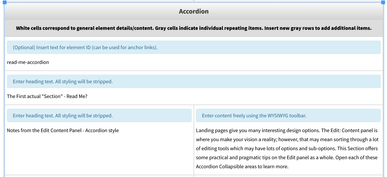
The Snippet is now inserted in the Edit section and ready to use. You will follow the gray instructions in the Snippet window to select the look and edit what content goes inside.

Table Editor Fields:
- Insert Text for Element ID (Optional): Add text if you want to create an anchor link.
- Heading Text: Enter the title for your accordion section. Styling such as font and size is pre-set.
The following fields make up one item inside the accordion card. - Heading Text: The title of the accordion listing.
- WYSIWYG Toolbar: The content inside of the accordion listing. (Can be toggled between hidden or a shown state)
To create an item inside the accordion, add a new instance of the accordions item row at the bottom of the table editor:

To remove an item from the accordion, delete its corresponding row:

For additional information on adding and removing rows, See 'Rows' instructions in Table Editor Guide.
Troubleshooting: Common errors like alignment issues, spacing/padding issues, etc. can be fixed by using the table properties tab as shown above.
How to Insert a Gateway Nav (Quick Links) Snippet
What this is: Creates a set of simple, easy-to-scan navigation links. These are typically displayed
on the top of the webpage, making it easier for visitors to quickly access important
resources.
When to use:
• To highlight frequently used resources (e.g., Library, Catalog, Admissions)
• To provide shortcuts to student, faculty, or staff services
• To group together links for a specific audience (e.g., Future Students, Alumni,
Parents)
• To improve usability by reducing clicks to key content
Select Gateway Nav (Quick Links) from the Snippet select menu.
The Snippet is now inserted in the Edit section and ready to use. You will follow the gray instructions in the Snippet window to select the look and edit what content goes inside.

Table Editor Fields:
- Heading Text (Optional): A title for your quick links section (e.g., Quick Links, Resources, I Want To…).
- Bulleted Link Text: The clickable text that visitors will see (e.g., Apply Now, Student Portal).
Replace the links. See ‘Inserting and Editing Links’ in Getting Started Guide.
How to Insert a Carousel Snippet
What this is: Creates a rotating slideshow of images, content, or links. It’s an engaging way to
highlight multiple pieces of content in the same space.
When to use:
To feature upcoming events, announcements, or deadlines
•To showcase images, videos, or highlights from programs and activities
•To spotlight featured stories, student success, or faculty profiles
•To provide rotating links to key resources or promotions
Select Carousel from the Snippet select menu.
The Snippet is now inserted in the Edit section and ready to use. You will follow the gray instructions in the Snippet window to select the look and edit what content goes inside.


Table Editor Fields:
- Color Theme: Choose background color for the Snippet from various options provided.
- Element ID: -n/a-
- Heading: Add a title for the section. Styling is pre-set.
- Display Items: Select the number of items to display on screen at a time.
The following fields make up one item inside the carousel. - Link URL: (Optional) Add a clickable link so users can learn more.
- Image: Insert the main image for the slide. Use high-quality, properly sized images for the best results.
- Title Text: Add a heading for each slide.
- Teaser Text: Add supporting text such as captions, summaries, or calls to action.
To add more items inside the carousel, add a new instance of the carousels row at the bottom of the table editor:

To remove an item inside the carousel, delete its corresponding row:

For additional information on adding and removing rows, See 'Rows' instructions in Table Editor Guide.
How to Insert an Interior Spiff Bank Snippet
What this is: The Interior Spiff Bank Snippet creates a set of visually engaging boxes that highlight
key links, resources, or calls to action. These “spiffs” make important information
stand out on a page.
When to use:
• To provide quick navigation to related pages or services
• To draw attention to deadlines, events, or announcements
Select Interior Spiff Bank from the Snippet select menu.
The Snippet is now inserted in the Edit section and ready to use. You will follow the gray instructions in the Snippet window to select the look and edit what content goes inside.

Table Editor Fields:
There is only one field inside the table editor for this Snippet. However each item inside this field is important in rendering the Snippet.
- Spiff Title: The heading that appears on each spiff card (ie. Interior Page Spiffs Bank)
- Image/Icon (Optional): Add an image or icon to make the spiff more visually engaging.
- Link URL: The page or resource the spiff should link to. See ‘Inserting and Editing Links’ in Getting Started Guide.
- Spiff Description (Optional): A short sentence or phrase that adds context to the spiff.
How to Insert an Interior Spiff Bank Row Snippet
What this is: The Interior Spiff Bank Row Snippet creates a single horizontal row of “spiffs” (visual
link boxes) that highlight important links or calls to action in a clean, banner-like
format.
When to use:
• To highlight 2–4 key links in a row
• To promote quick actions like Apply Now, Request Info, Visit Campus
• To guide users to featured resources, tools, or services
• To break up long text with an eye-catching navigation row
Select Interior Spiffs Bank Row from the Snippet select menu.
The Snippet is now inserted in the Edit section and ready to use. You will follow the gray instructions in the Snippet window to select the look and edit what content goes inside.

Table Editor Fields:
All fields inside the table editor behave the same. Each field is its own spiff bank, with the items inside this field being important in rendering the Snippet.
- Spiff Title: The main heading that appears on each spiff.
- Image/Icon (Optional): Add an image or icon to visually distinguish each spiff.
- CTA Button: The page or resource the spiff links to.
- Spiff Description (Optional): A short supporting phrase (e.g., “Submit your application today”).
Editing CTA Buttons in a Spiff Row
- Click on the CTA Button to edit.
- Click the Chain Link icon in the toolbar.

Edit the links for the buttons. See ‘Inserting and Editing Links’ in Getting Started Guide
How to Insert a UH in the News Snippet
What this is: Showcases recent media coverage or news stories featuring the University of Houston.
When to use: Pages that aim to showcase UH news articles, mentions, or press releases where UH
or its faculty, students, or research have been featured in external media outlets.
Select UH in the News from the Snippet select menu.

Table Editor Fields:
- Heading: Sets the heading text to be displayed.
The following fields make up one news listing inside the UH in the News Snippet: - Link to the news item: The link to the news item as well as the display text for the link. See ‘Inserting and Editing Links’ in Getting Started Guide.
- Text of the news source: Displays the source of the news item.
To create more news listings, add a new instance of the news listings row at the bottom of the table editor:

To remove a news listing, delete its corresponding row:

For additional information on adding and removing rows, See 'Rows' instructions in Table Editor Guide.
How to Insert a Card - Call to Action Snippet
What this is: An easy to configure call-to-action card for content creators to drive user engagement
and highlight key actions across the website.
When to use: Events, services, programs, or any featured Call to Action.
Select Card - Call to Action from the Snippet select menu.


Table Editor Fields:
- Content Alignment: Sets card content to be either left aligned or center aligned.
- Add Space After: Adds a space below the card on the page. If you choose 'Yes', it adds some space (like a gap). If you choose 'No', there's no extra space.
- Background: Choose the card's background color. Options include Red, Brick Red, Light Gray, Slate Gray, Black and Cream. The text color will change on its own based on the background color to ensure readability.
- Bootstrap Icon Class Name: Enter a valid Bootstrap icon (must start with bi-) to show an icon. Find icons here: https://icons.getbootstrap.com/
- Icon Size: Sets the size of the Icon to either small or large.
- Icon Position: Sets the icon's position to either the top or to the left of the heading. A left positioned icon will only display if the card alignment is set to ‘Left’.
- Heading: Sets the heading of the Call-to-Action card to be displayed. Must have something in this field, or the card will not render.
- Description: Adds a description to the card. Can be left blank.
- Button Link: Set the link of the button. Must have something in this field, or the button will not render.
- GTM Class Name: An optional field used for tracking in Google Analytics. It doesn’t affect how the Snippet looks. Recommended to add if you know the right name to use.
- Button Display Text: The text that is displayed on the button. Must have something in this field, or the button will not render.
- Button Screen Reader Text: An optional field that can be used to provide additional context to screen readers to improve accessibility. Recommended to add if you are knowledgeable on accessibility standards for screen reader text.
Fields 13-16 are the exact same as fields 9-12. This is not a mistake — each set of fields is for a separate button.
The first set is for Button 1, which has placeholder values already filled in. The second set is for Button 2, which is empty and optional.
At least ONE button must be filled in for the card to render.
Button Link and Button Display Text are REQUIRED fields for the button to render.
How to Insert a Stats - Feature Snippet
What this is: Displays key statistics and information about an organization, service, or team in
a visually engaging format.
When to use: Highlighting key numbers or facts that help people quickly understand impact, performance,
or value.
Select Stats - Feature from the Snippet select menu.
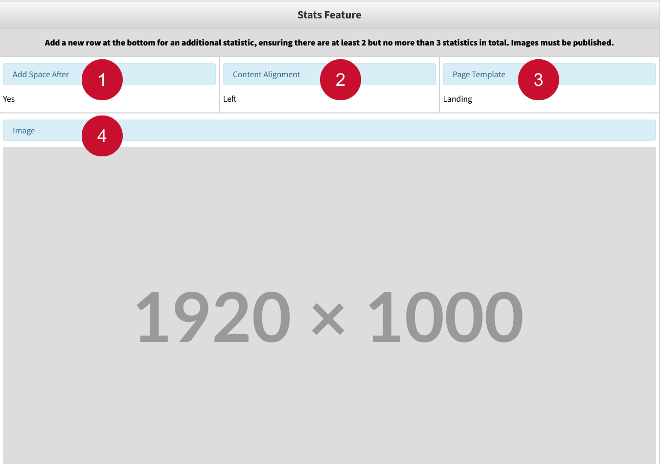

Table Editor Fields:
- Add Space After: Adds a space below the Snippet on the page. If you choose 'Yes', it adds some space (like a gap). If you choose 'No', there's no extra space.
- Content Alignment: Aligns the heading, description, and button of the Snippet to be either left aligned or right aligned.
- Page Template: Choose Landing (default) for full-width landing page templates or Interior for templates with narrower layouts — this sets the spacing and layout, so the Snippet looks good on all screen sizes.
- Image (REQUIRED): Sets the background image of the stats feature.
- Heading (REQUIRED): Sets the heading text to be displayed.
- Description (REQUIRED): Sets the description text to be displayed.
- Button Link & Button Display Text (REQUIRED): Sets the display text and the link of the stats-feature button. These fields are
required for the Snippet to render.
The following fields make up one stats listing inside the Stats Feature Snippet: - Stat Number: Numerical statistical value.
- Stat Item: What the statistic represents.
Both the Stats Number and Stats Item fields must be filled in order for the stats listing to render.
A minimum of two stats listings are required for the Snippet to render. A maximum of three stats listings can be rendered.
To create another listing, add a new instance of the stats listing row at the bottom of the table editor:
To remove a listing, delete its corresponding row:
For additional information on adding and removing rows, See 'Rows' instructions in Table Editor Guide.
How to Insert a Layout - Section Snippet
What this is: A distinct and highly customizable section to display WYSIWYG content. Can be used
to hold all content present in the WYSIWYG toolbar, including Snippets.
When to use: Create distinction between sections on a page, improve formatting of content on landing
pages.
Select Layout - Section from the Snippet select menu.

Table Editor Fields:
- Width: Set the sections width, and how content inside of it are laid out.
- Full Width: Makes the section stretch the full width of the page. No extra spacing is added.
- Standard Width: Adds spacing to the sides of the content. Good for keeping content neatly centered on the page, recommended for landing pages.
- Text Width – Left Aligned: Narrows the content for better readability, aligned to the left. Best for text-heavy sections, recommended for interior pages.
- Text Width – Center Aligned: Narrows the content for better readability, aligned to the center. Best for text-heavy sections, recommended for interior pages.
- Content Alignment: Aligns the content to either to the left or the center.
- Add Space After: Adds a space below the section. If you choose 'Yes', it adds some space (like a gap). If you choose 'No', there's no extra space.
- Background: Sets the background of the section. Options include colors White, Light Grey, Brick Red, and Slate Grey. There is also an Image option, which will use the user's image as the background.
- Background Image: Enter background image path for section to use. Background must be set to Image for this to get used.
- Background Image Color Overlay: Sets a color overlay over the image to either Red or Black.
- Background Image Color Overlay Opacity: Sets the color overlay opacity.
- WYSIWYG Editor: Holds all WYSIWYG content for the section.
How to Insert a Layout - Column Snippet
What this is: Organizes WYSIWYG content into columns.
When to use: Organizing list-based content into multiple columns for readability. Examples include
People Card Snippets, Vertically Aligned General Card Snippets, Lists of text.
Select Layout - Columns from the Snippet select menu.
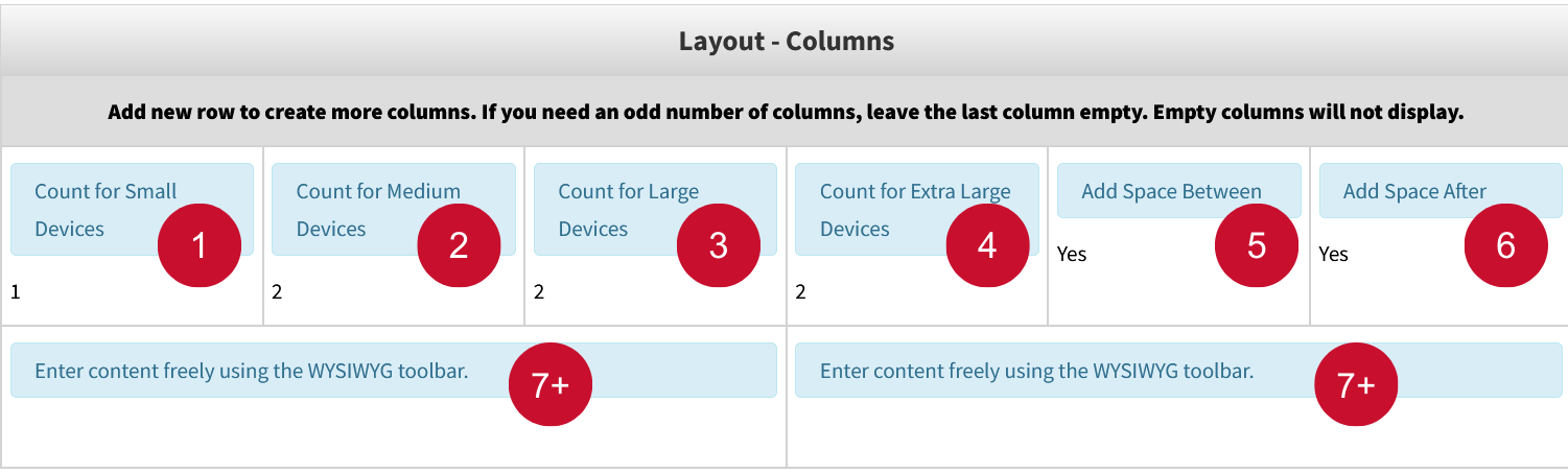
Table Editor Fields:
Column Count Fields: The first 4 fields set the number of columns to display per screen size. Each screen size has a range of columns that can be set for it.
- Count for Small Devices: 1-4 Columns can be displayed in any given row.
- Count for Medium Devices: 1-4 Columns can be displayed in any given row.
- Count for Large Devices: 2-5 Columns can be displayed in any given row.
- Count for Extra Large Devices: 2-6 Columns can be displayed in any given row
- Add Space Between: Adds a space between the columns when set to yes.
- Add Space After: Adds a space below the Snippet on the page when set to yes.
- WYSIWYG Editor: Each WYSIWYG editor is the content for one column. If a WYSIWYG editor is left empty, it will not be used as a column.
To create more columns, add a new instance of the WYSIWYG row at the bottom of the table editor:
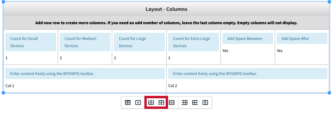
To remove a column, delete its corresponding row:
For additional information on adding and removing rows, See 'Rows' instructions in Table Editor Guide.
How to Insert a Stats Section Snippet – Landing Page
What this is: A content block that displays a larger group of key statistics or data points in
a clean, visually engaging format — often using large numbers, short labels, and icons
to quickly convey important facts.
When to use: Highlighting multiple numbers or facts that help people understand impact, performance,
or value.
Select Stats Section from the Snippet select menu.

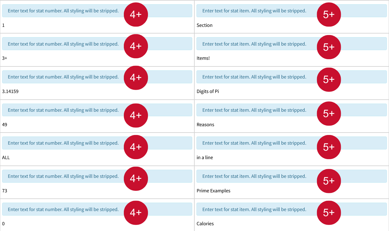
Table Editor Fields:
- Insert text for element ID: Provide a unique identifier for the section. It has no effect visually but can be utilized for anchor links.
- Color theme: Select the background color of the section. Options include Slate, Light Gray, Cream, Brick Red, White.
- Heading: Sets the heading text to be displayed.
The following fields make up one stats item inside the stats section: - Stat Number: Numerical statistical value.
- Stat Item: What the statistic represents.
To create more stats items, add a new instance of the stats item row at the bottom of the table editor:

To remove a stats item, delete its corresponding row:

For additional information on adding and removing rows, See 'Rows' instructions in Table Editor Guide.
How to Insert a Split Content Snippet – Landing Page
What this is: Displays a section with an image on one side and WYSIWYG content on the other.
When to use: Illustrating steps and instructions with images, team introductions, program highlights,
etc.
Select Split Content Section from the Snippet select menu.
The Snippet is now inserted in the Edit section and ready to use. You will follow the gray instructions in the Snippet window to select the look and edit what content goes inside.
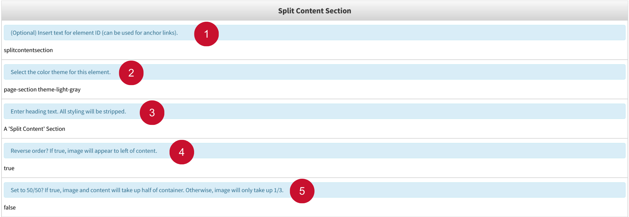
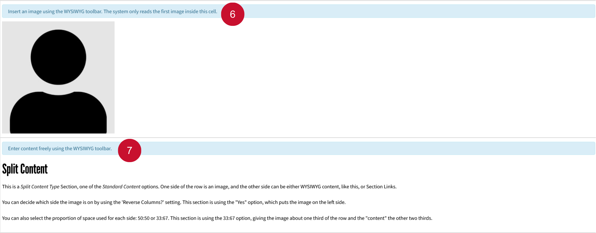
Table Editor Fields:
- Insert text for element ID: Provide a unique identifier for the section. It has no effect visually but can be utilized for anchor links.
- Color theme: Select the background color of the section. Options include Slate, Light Gray, Cream, Brick Red, White.
- Heading: Sets the heading text to be displayed.
- Reverse order: Reverses the order of what gets displayed first (left side of the section), Image or WYSIWYG Content. True makes the image display first, while false makes the WYSIWYG content display first.
- 50/50: Makes the image and content take up the same amount of space equally (50/50). Set to false by default, which sets image to take up 1/3 of the section.
- Image: Sets the image to be displayed.
- WYSIWYG editor: Holds all WYSIWYG content for the section.
Table Editor Guide
Table editors offer a user-friendly way to customize and configure settings without writing a single line of code. While some Snippets are straightforward and work out of the box, others are more complex and require a deeper understanding of how to modify the table editor to fully unlock their potential.
There are 8 different options to interact with the table editor. To view them, click inside any table editor and the following buttons will pop up:
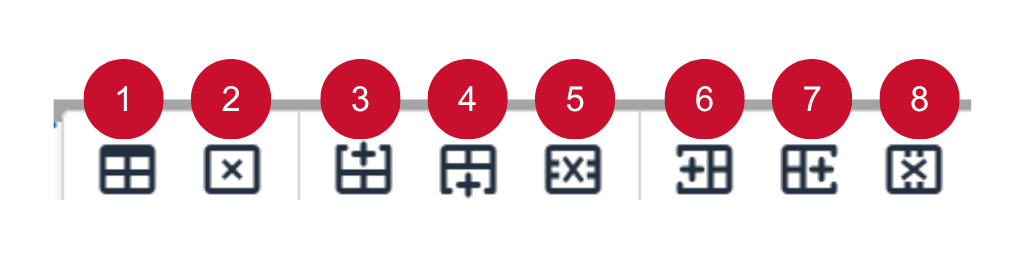
Here are brief descriptions of each button from left to right:
Table Properties: Edit properties such as width, height, spacing, padding, and more.
Delete Table: Delete the entire table.
Insert Row Before: Adds a new row to the top of the selected row.
Insert Row After: Adds a new row to the bottom of the selected row.
Delete Row: Delete the entire selected row.
Insert Column Before: Adds a new column to the left of the selected column.
Insert Column After: Adds a new column to the right of the selected column.
Delete Column: Delete the entire selected column.
Rows:
Many Snippets require adding rows to make full utilization of their features. Inserting new rows inside the table editor is helpful to add new content to the Snippet, without having to recreate the Snippet table editor.
Although Modern Campus uses the term “insert,” a more accurate description in the case of rows would be “duplicate.” When you insert a row in the table editor, it duplicates the structure of the currently selected field (or row). The new row—whether inserted above or below—mirrors the layout and field types of the selected one, allowing for consistent formatting and easier data entry. This behavior ensures that the inserted row aligns with the table's existing structure without requiring manual configuration.
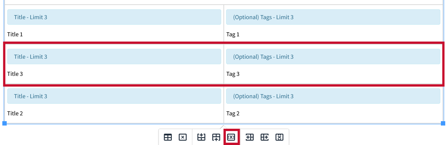
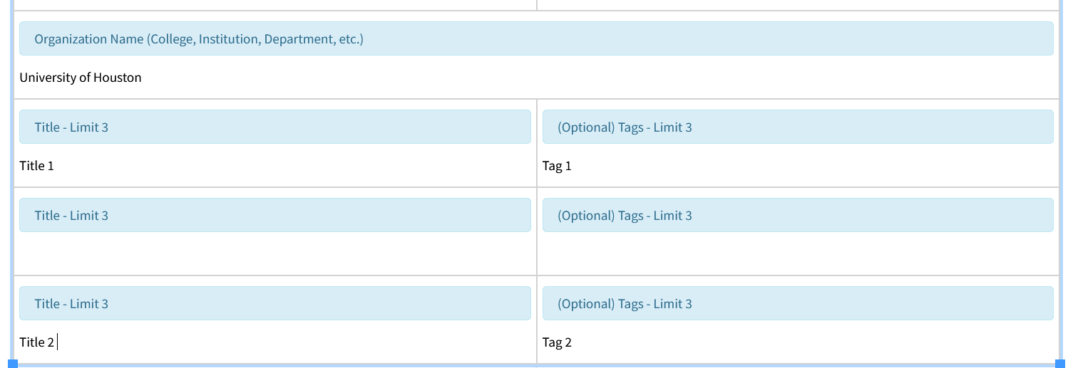
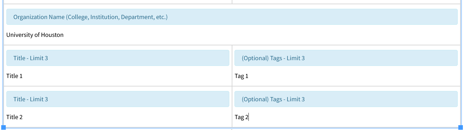
Below is an example of using rows inside the table editor with the Card – People Snippet:
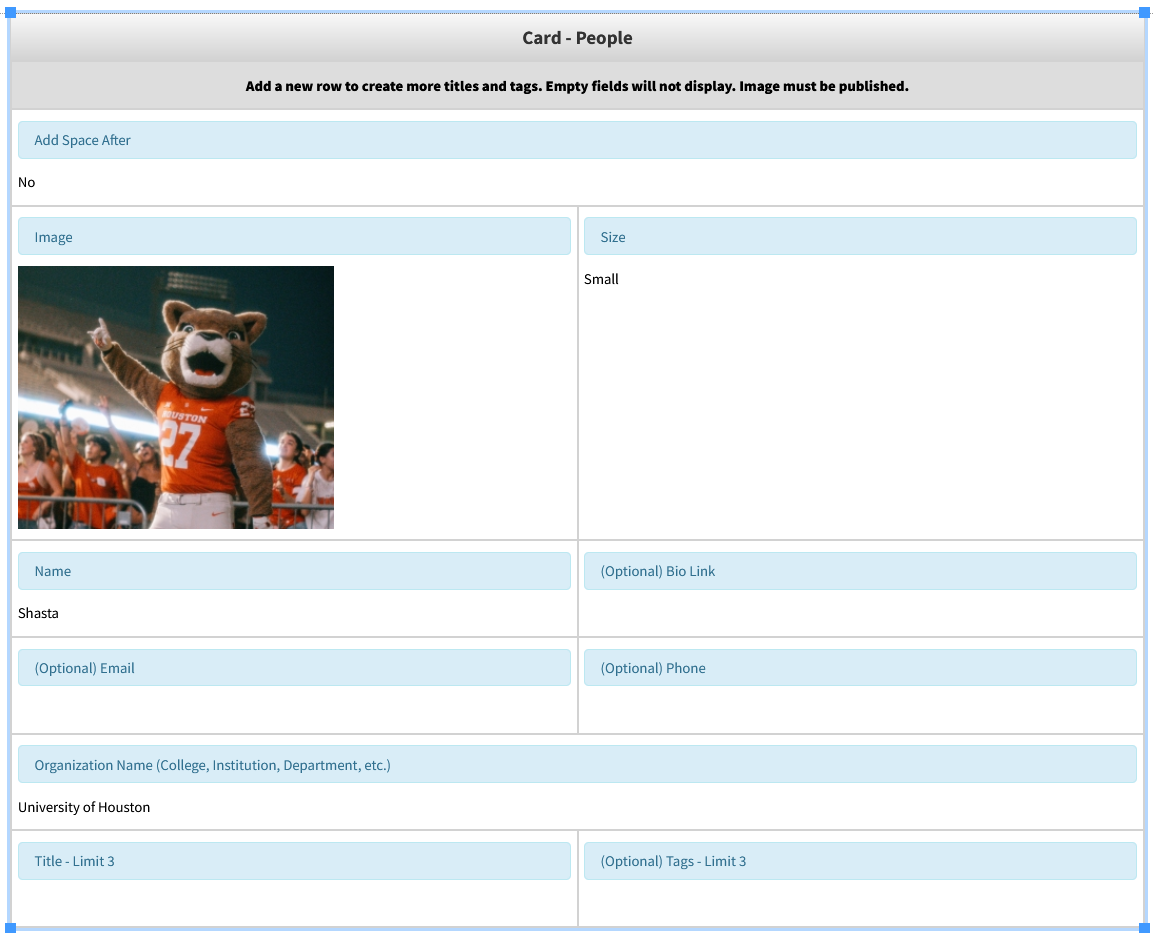
One of the features of this Snippet is the ability to add titles and tags associated with any given person. By default there is only one row in the table editor to add titles and tags, even though up to 3 are supported.
Lets add 2 more titles and tags to our people card.
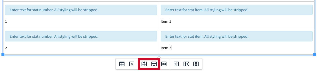
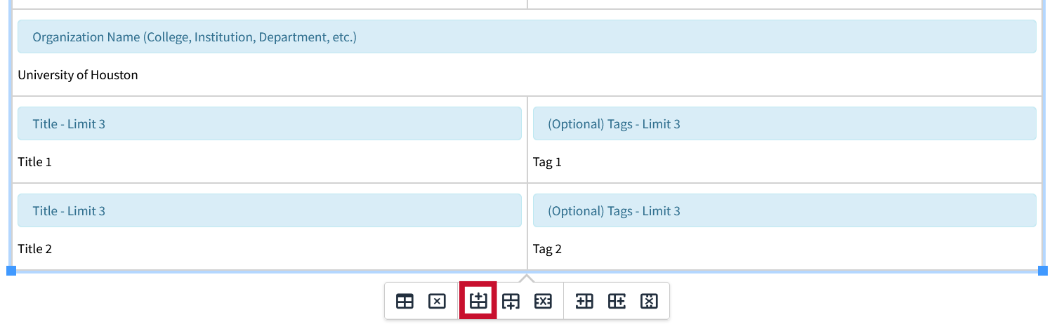
1. Insert Row After:
Select the row which we want to add another instance of and click the “Insert Row After” Button. This will insert a duplicated instance below the selected row.
In this instance we would select the last row, which is the one with the Title and Tag fields, since we would like additional instances of each.
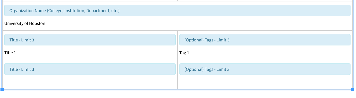
2. Insert Row Before:
To insert a new row before an existing one, first select the row you'd like to duplicate. Then, click the "Insert Row Before" button. This will insert a duplicated instance above the selected row.
In this instance we have selected the bottom most row.
We now have three instances of Titles, and Tags added to our people card.
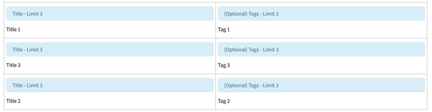
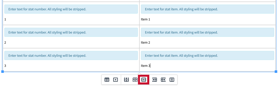
3. Delete Row:
To delete a row, select the row that you would like removed, and click the “Delete Row" button.
In this instance, we have selected the middle row.
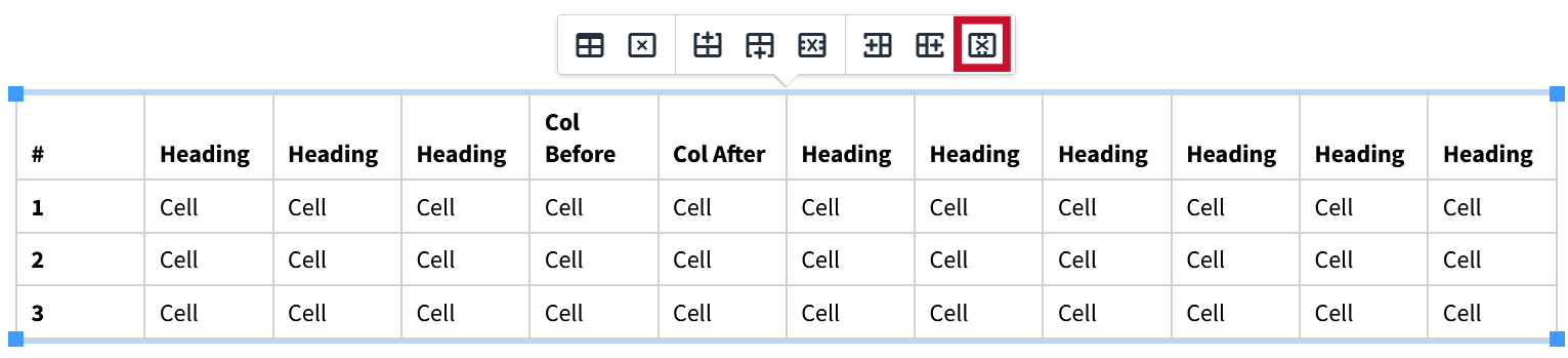
Columns
Understanding how columns work in the Snippet table editor gives you greater control, allowing you to get the most out of any Snippet that involves adding columns.
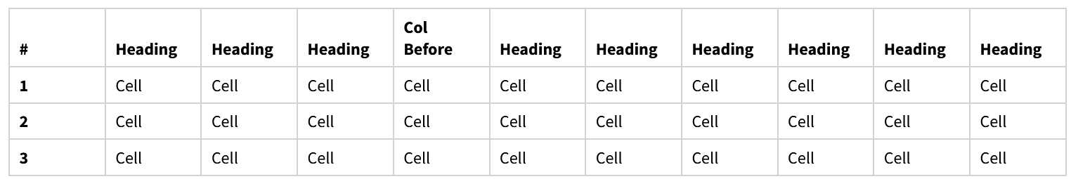
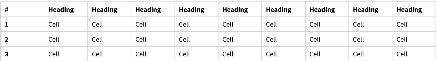
Below is an example of using columns inside the table editor with the Responsive Table Snippet:
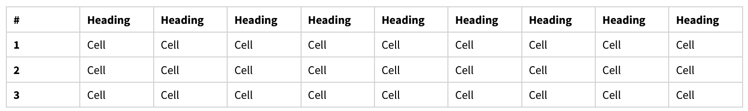
One of the features of this Snippet is the ability to add or remove columns as you would with a typical table in something like Word.
There is no limit to the number of columns or rows that can be added to the responsive table, but by default there are 10 columns and 3 rows.
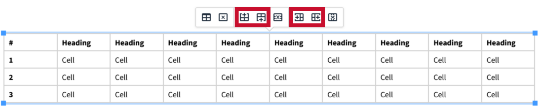
Lets add 2 columns to our table:
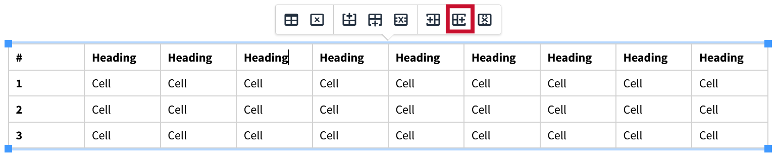
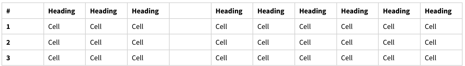
1. Insert Column After:
Select the column for which you would like to add a new one to the right of and click the “Insert Column After” button.
In this instance we have selected the fourth column.
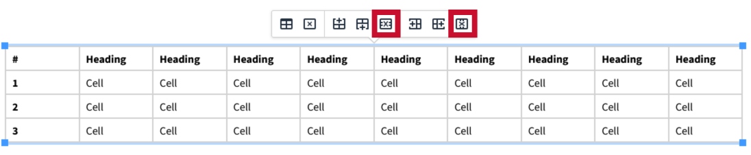
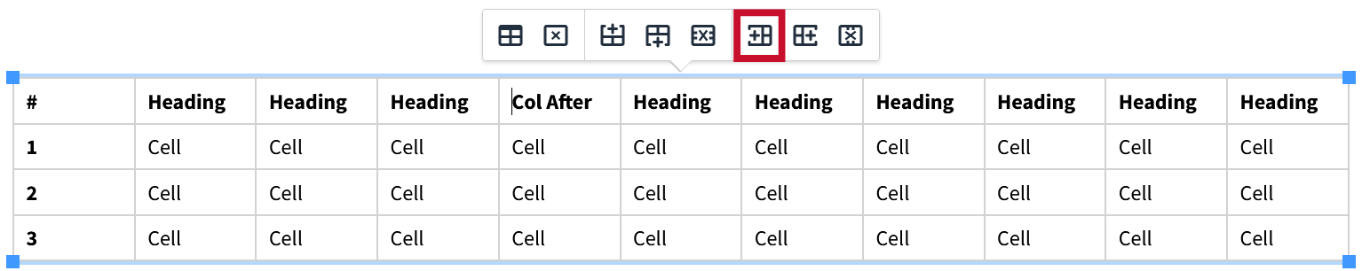
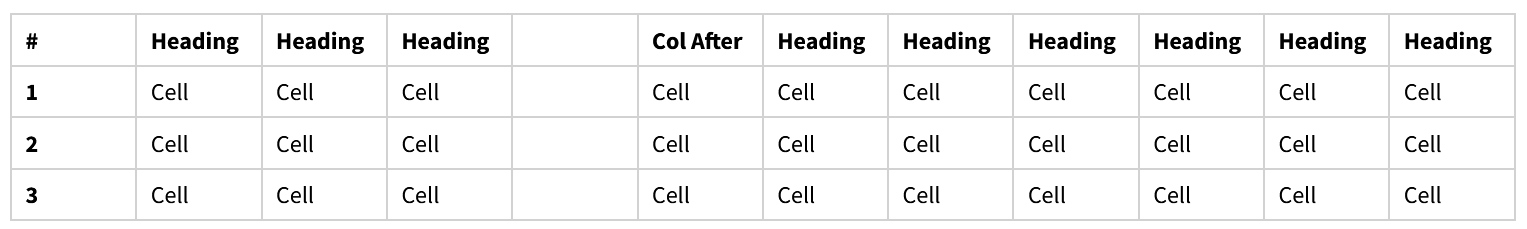
2. Insert Column Before:
To insert a column to the left of one, simply select the column you would like to add a new one to the left of and click the “Insert Column Before” button.
In this instance we have selected the newly added fourth column.
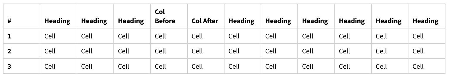
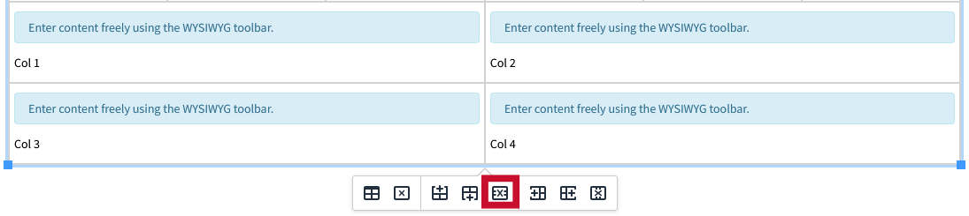
3. Deleting Columns:
To delete a column, select the row that you would like removed, and click the “Delete Column" button.
In this instance we have selected the "inserted after" column to delete.