Web Style Guidelines
While all of the UH Brand Guidelines apply to the web as a medium, there are more specific guidelines that should followed for UH websites.
Table of Contents
Color
Special considerations should be made when using color on the UH website. When color is used correctly or incorrectly, it can either help or hinder the usability and accessibility of the website.
RGB Color Values Brand
All color used on the web — defined in CSS or used in graphics and video — should match the RGB or HEX color values defined by the UH Style Guidelines for color. Converting PMS or CMYK color values to RGB or HEX in graphics editing software will not always result in the correct color values.
Primary Brand Colors
-

- Red
- RGB: 200, 16, 46
- HEX: #c8102e
-

- Teal
- RGB: 0, 179, 136
- HEX: #00b388
-

- Gold
- RGB: 246, 190, 0
- HEX: #f6be00
-

- Gray
- RGB: 136, 139, 141
- HEX: #888b8d
-

- White
- RGB: 255, 255, 255
- HEX: #ffffff
Secondary Brand Colors
-

- Brick
- RGB: 150, 12, 34
- HEX: #960c22
-

- Green
- RGB: 0, 134, 108
- HEX: #00866c
-

- Mustard
- RGB: 216, 155, 0
- HEX: #d89b00
-

- Slate
- RGB: 84, 88, 90
- HEX: #54585a
-

- Cream
- RGB: 255, 249, 217
- HEX: #fff9d9
Tertiary Brand Colors
-

- Chocolate
- RGB: 100, 8, 23
- HEX: #640817
-

- Forest
- RGB: 0, 89, 80
- HEX: #005950
-

- Ocher
- RGB: 185, 120, 0
- HEX: #b97800
-

- Black
- RGB: 0, 0, 0
- HEX: #000000
Percentages of the UH color palette can be used on the web. For example, a lighter tint of teal may be desired as a background color. In that case, the background color can be defined in CSS with RGBA, where the RGB values do not change from the original color, and the A value sets the alpha transparency.
-
- 90% Teal
- RGBA: 0, 179, 136, 0.9
- HEX: #1aba94
-
- 80% Teal
- RGBA: 0, 179, 136, 0.8
- HEX: #33c29f
-
- 70% Teal
- RGBA: 0, 179, 136, 0.7
- HEX: #4dcaac
-
- 60% Teal
- RGBA: 0, 179, 136, 0.6
- HEX: #66d1b7
-
- 50% Teal
- RGBA: 0, 179, 136, 0.5
- HEX: #80d9c4
-
- 40% Teal
- RGBA: 0, 179, 136, 0.4
- HEX: #99e1cf
-
- 30% Teal
- RGBA: 0, 179, 136, 0.3
- HEX: #b3e8db
-
- 20% Teal
- RGBA: 0, 179, 136, 0.2
- HEX: #ccf0e7
-
- 10% Teal
- RGBA: 0, 179, 136, 0.1
- HEX: #e6f8f3
Color defined as RGBA only works on elements that are placed on a white background. For elements placed on a background color other than white, the non-transparent HEX values must be calculated with image editing software.
Color Contrast Accessibility
Following Web Content Accessibility Guidelines (WCAG), there must be sufficient contrast between foreground colors (text and graphics) and background colors to accommodate low vision and colorblind users on the UH website.


The following tables use the UH color palette to demonstrate foreground and background color combinations that pass and fail the WCAG AA test for adequate contrast ratio. Do not use color combinations on the UH website that fail to provide adequate contrast.
Color Combinations That Pass

Color Combinations That Fail

Typography
All UH typefaces are supported on the UH website. The following outlines how they can and should be used on the web.
- League Gothic Regular
- Source Sans 3 Light
- Source Sans 3 Light Italic
- Source Sans 3 Regular
- Source Sans 3 Italic
- Source Sans 3 Bold
- Source Sans 3 Bold Italic
- Source Sans 3 Black
- Source Sans 3 Black Italic
- Crimson Pro Regular
- Crimson Pro Italic
- Crimson Pro Semibold
- Crimson Pro Semibold Italic
- Crimson Pro Bold
- Crimson Pro Bold Italic
Web Fonts Brand
League Gothic, Source Sans 3, and Crimson Pro can be used as web fonts in the following ways:
- UH websites on the
uh.edudomain that are published with Modern Campus CMS include the web fonts automatically in the<head>of the html. - UH websites on the
uh.edudomain that aren't published with Modern Campus CMS or UH websites on a domain name other thanuh.educan include the web fonts in one of two ways:- Including these lines of code in the
<head>of your html:<link rel="preconnect" href="https://fonts.googleapis.com"><link rel="preconnect" href="https://fonts.gstatic.com" crossorigin><link href="https://fonts.googleapis.com/css2?family=Crimson+Pro:ital,wght@0,400;0,600;0,700;1,400;1,600;1,700&family=League+Gothic&family=Source+Sans+Pro:ital,wght@0,300;0,400;0,700;0,900;1,300;1,400;1,700;1,900&display=swap" rel="stylesheet"> - Or, including this stylesheet:
https://www.uh.edu/css/fonts.css
- Including these lines of code in the
Do not use lookalike typefaces in place of League Gothic, Source Sans 3, or Crimson Pro. Microsoft alternate fonts should also not be used on UH websites.
Typeface Usage Brand
League Gothic is the preferred typeface for text contained in heading tags (<h1>, <h2>, <h3>, etc.). Headings should be set in title case and can be styled with all uppercase
letters (text-transform: uppercase;).
Source Sans 3 is suitable for body copy and sub-headings, and is recommended for all microcopy (call to action links, navigation, form elements, buttons, and other user-interface elements).
Crimson Pro is also suitable for body copy and sub-headings. Crimson Pro is a serif font designed for readability on computer displays. We encourage its use as paragraph text where appropriate and recommended a base font size of at least 18 pixels.
Crimson Pro Body Copy
At the University of Houston, you'll find a college experience that will transform your future to what you envision. Our nationally-ranked programs drive students to discover the multitude of academic resources that are available on-campus and online while our student-run organizations and athletics have something for everyone and connect students in authentic Coog culture. Volunteerism and community service are also a big part of UH's commitment to engage students directly with local centers and nonprofits. We are Houston's University.
Legible Font Sizes Usability
Google recommends that web type have a base font size of at least 16 pixels. Small text should be used sparingly and sized no smaller than 75% of the base font size (i.e., no smaller than 12 pixels).
Content
Web content should be carefully treated to aid the findability, accessibility, and usability of UH web pages.
Title Tag
SEO
All UH web pages should have a <title> tag in the <head> of the document. The title tag should include the page title, the site name, and
University of Houston. Optimal formatting of the tag is <title>Page Name - Site Name | University of Houston</title>. A website's home page can simply be <title>Site Name | University of Houston</title>. Websites published with Modern Campus CMS have | University of Houston appended to the tag automatically.
Meta Description Tag SEO
Like the title tag, all UH web pages should have a meta description located in the
<head> of the document. The meta description should be a concise explanation of the web
page contents or whole website in the case of a home page. The meta description content
is displayed on search engine result pages to help users understand the contents of
the page before clicking the link.
Heading Tags SEO Accessibility Usability
Heading tags (<h1>, <h2>, <h3>, etc.) should be used to clearly outline the content on UH web pages and to break
up pages of paragraph text into smaller more easily scanned sections of content. Do
not simply use bold paragraph text to indicate headings. Heading tags not only make
web page content more readable (both visually and with screen reading technology),
they also indicate important keywords to search engines.
Content Sized to Viewport Usability
All UH web page content should fit horizontally within a browser window or device's viewport size. It is important that UH web pages are designed and tested in various viewport widths, and that all kinds of content (tables, forms, videos, etc.) do not render past the visible width of the viewport.
Alt Text for Images SEO Accessibility
All images on UH web pages must include the alt attribute to support accessibility, improve SEO, and provide fallback content when images fail to load.
Purpose of Alt Text
- Accessibility: Describes the image for users relying on screen readers.
- Fallback Content: Displays when an image fails to load.
- SEO: Helps search engines understand the image content.
General Guidelines
- Use clear, concise descriptions that convey the image’s purpose or content.
- Avoid phrases like “image of” or “graphic of”—screen readers already announce the image type.
- Do not use the image file name as alt text; it rarely conveys meaningful information.
Decorative Images
If an image is purely decorative and does not convey meaningful content or context, use an empty alt attribute (alt=""). This tells screen readers to skip the image.
Use empty alt text only when:
- The image adds visual flair but no informational value.
- The image is redundant with adjacent text.
Image File Sizes Performance
All images on UH web pages should be optimized to reduce file size as much as possible without significantly affecting image quality. In general, thumbnail images should be no larger than around 100 KB, and other large images should be no larger than around 250 KB. UH web pages with images significantly over these limits require a high amount of bandwidth to be displayed and can take a long time to load and render on the page for users on slow connections.
Vector Graphics Performance
When using icons, logos, and other simple graphics on the UH website, scalable vector graphics (SVG files) are preferable over bitmap graphics (PNG and GIF files). SVG files are usually smaller in file size and can be scaled to any size and rendered on high pixel density displays without appearing pixelated.
Navigation
Headers, footers, and other forms of navigation should be styled consistently to provide a cohesive user experience across multiple UH websites, and should adhere to these guidelines formed by the results of usability testing on the UH website.
Headers Usability Brand
Do not change the default styling options of the UH header. It is important that UH websites are branded consistently. The UH wordmark located in these headers should always link to the main UH home page (http://www.uh.edu). A link for Give to UH (or other UH entity, e.g., Give to College of the Arts) should be present in the header.
Secondary Header
The secondary header is the default for all other UH websites. It uses the secondary UH wordmark which links to the main UH home page and utilizes a type treatment to clearly identify the website name and links to the home page for that website. Multiple color options are available to help distinguish the website from others.
Minimal Header

The minimal header can be used for simple landing pages or web applications which don't require a site name and navigation. The University of Houston wordmark must be present but search and other tactical navigation links are optional.
Footers
Usability Brand
In addition to multiple header options, UH websites published with Modern Campus CMS have multiple options for the footer.
Site Footer

The main UH footer contains contact information for the university, additional links that are relevant to most users, and the primary social media accounts for the university. This footer may be used on any UH website without modification.
Websites may have their own footer formatted similarly to the main site footer, but with contact information, related links, and social media icons that are specific to that unit. It is important that if unique links are used that the unit be clearly identified (with a logo and contact information) to help avoid user confusion. Additional color options are available to help distinguish a site's custom footer from the main UH footer.
Global Footer
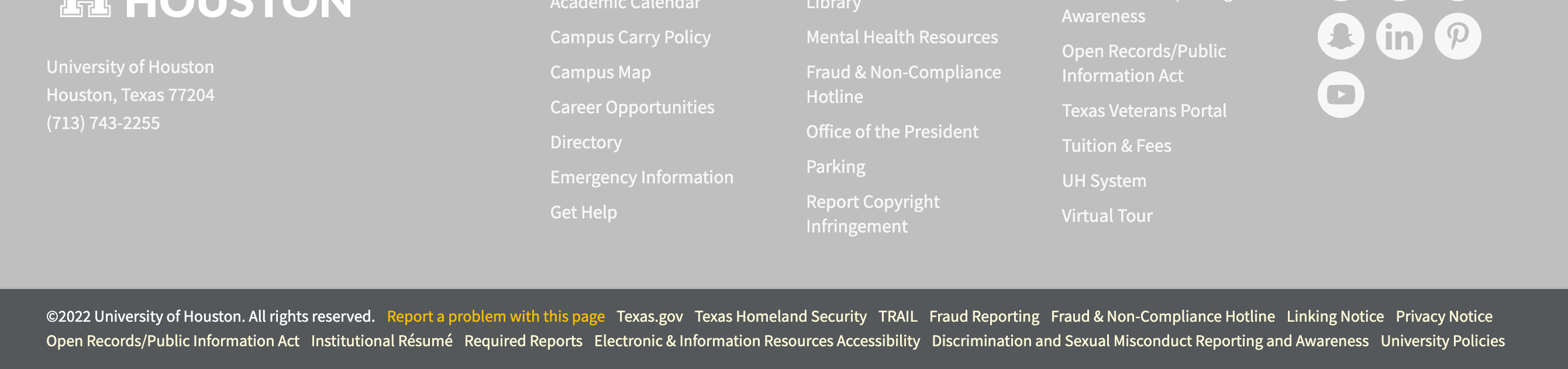
The global footer contains copyright information and state-required links. It's included automatically with the site footer but like the minimal header, may be used alone for simple landing pages, microsites, and web applications. The global footer should be present on all UH websites.
Primary Site Navigation
Usability
A UH website's primary navigation (the menu items located in the header) should contain links to the primary landing pages within that site only. Do not include links that go to other UH websites. Users expect links in the primary navigation to take them to child pages for that website and can become confused when they are sent to a different website and the navigation menu items have unexpectedly changed.
Hyperlink Targets Usability
Forcing a link to open in a new tab or window can cause confusion and is a practice that should be avoided. Users expect to use the browser’s back button to navigate to the previous page and when a link opens in a new tab or window, the back button does not send the user back to the previous page. Users can manually open links in a new tab or window using their browser if they wish. Not all users want to use or understand how to use multiple tabs or windows.
Touch Target Size
Usability
Buttons, links, form fields, and other user interface elements should be large enough and spaced far enough apart so that users with touchscreen devices can accurately tap the element without missing the target or unintentionally tapping another element. Such elements should be sized at least 48 pixels high and wide on mobile and other touchscreen devices.