Landing Page Template
The Landing Page Template provides CMS users with the opportunity of showcasing content in a multitude of ways. The template provides a wide array of options for customization. New additions include a more emphasized banner image, new page sections and more.
Table of Contents
Metadata
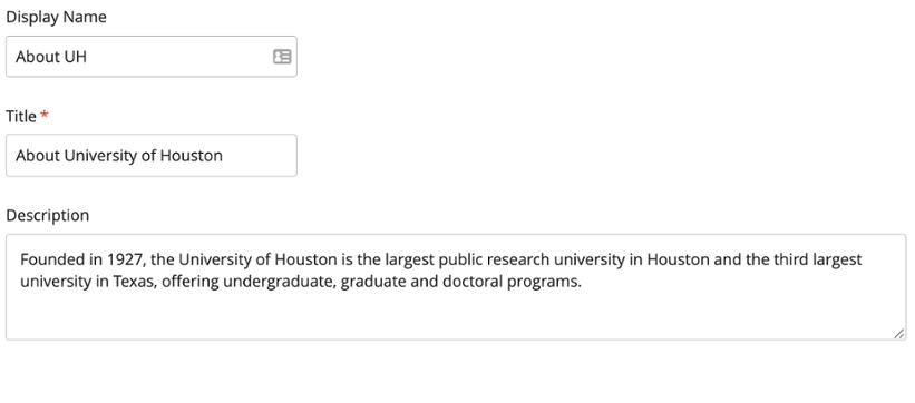
Display Name
The Landing Page Template uses text entered into Display Name as the text that will be overlaid on the banner image.
Title
A title element defines the title of the document, shown in the browser’s title bar or the pages tab. In the CMS, the Title text box is required to be filled on all pages.
Description
The Description text box should be filled with a brief summary of the information found on the page or the entity featured in the page. In the About UH page, it contains information about the University as a whole.
The figure below better showcases the information found in the About UH page, including Display Name, Title and Description.
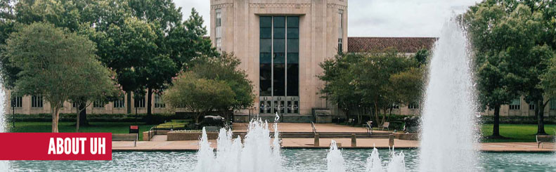
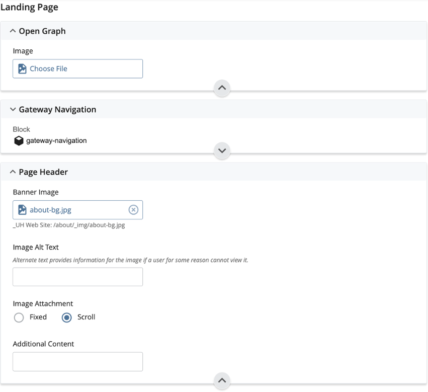
Page Header
Banner Image
By default, this page region will include the “Display Name” from metadata entered, and display the text as an H1 on the page. Additionally, the image attached can be made to scroll with the page or be fixed which will create a parallax effect as the page scrolls up or down. The “Alt Text” should be entered for all images and will be displayed if the image itself could not be loaded or if screen readers are being utilized. The following figure shows the current banner image on About UH.
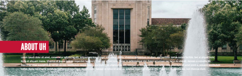
Additional Content
The CMS also allows the entry of “Additional Content,” which will be text displayed over the banner image itself. Below is an example of a banner image with placeholder text in “Additional Content.”
On-Page Navigation
This optional region provides the opportunity to link to different parts of the page which could be useful for very long pages with several page sections. The navigation links will appear once the user scrolls past the banner image. Assign a Section ID to the section that will be linked, then copy that Section ID preceded by a #, and include the Link Text to be displayed. Keep in mind that matching Section ID to Section Heading is recommended, but section ID can be shortened if necessary.

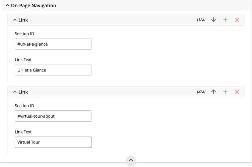
On the actual section the link will go to, head over to “Section Settings” and make sure the Section ID matches the ID entered in “On Page Navigation”. Remember the pound sign should only be included in “On Page Navigation,” and not on Section Settings.
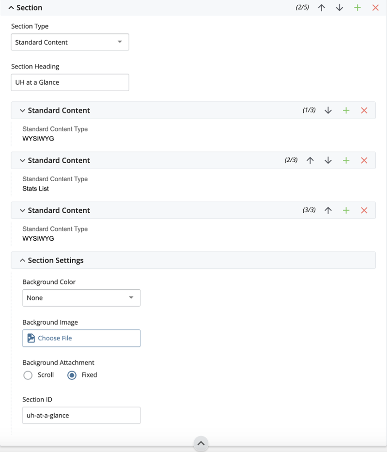
Page Sections
The content on the page should be contained within one or more Page Sections. Use multiple Page Sections to divide the page up by content types or subjects. There are four Section Types included in this template: Standard Content, Split Content, Cover Photo and Cover Video. Each one of these has different options to better customize content.
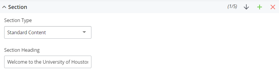
Standard Content
This is the most general and versatile Section Type. This Section Type should contain a Section Heading which will be placed on the page as an H2, followed by one or more of the following Content Types: WYSIWYG, Section Links, SPIFF Banks, Carousel, Stats List, Accordion, and Calendar Widget.

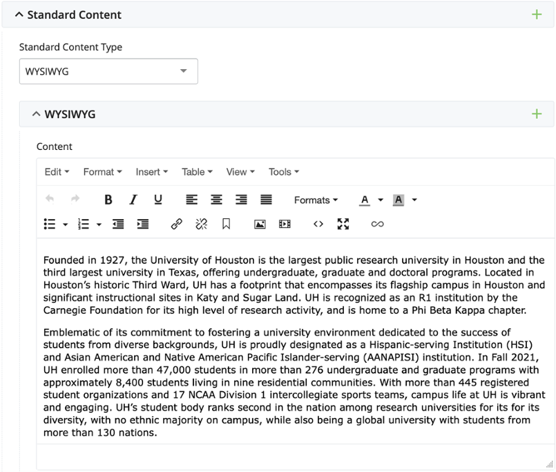
WYSIWYG
Use the WYSIWYG editor to add paragraphs or any other kind of content desired. Click the + icon to add multiple Content areas. Each Content area has a Content Width set to Auto by default, which evenly divides a row on the page by the number of Content areas. Changing the Content Width of an area to a value other than “Auto” will make that specific content area wider than others.
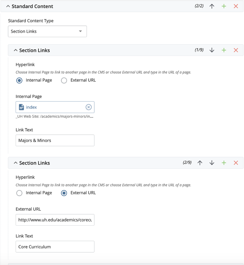
Section Links
These are links related to content in the Page Section. We recommend following WYSIWYG content with Section Links. The figure below shows what Section Links look like after a WYSIWYG section.
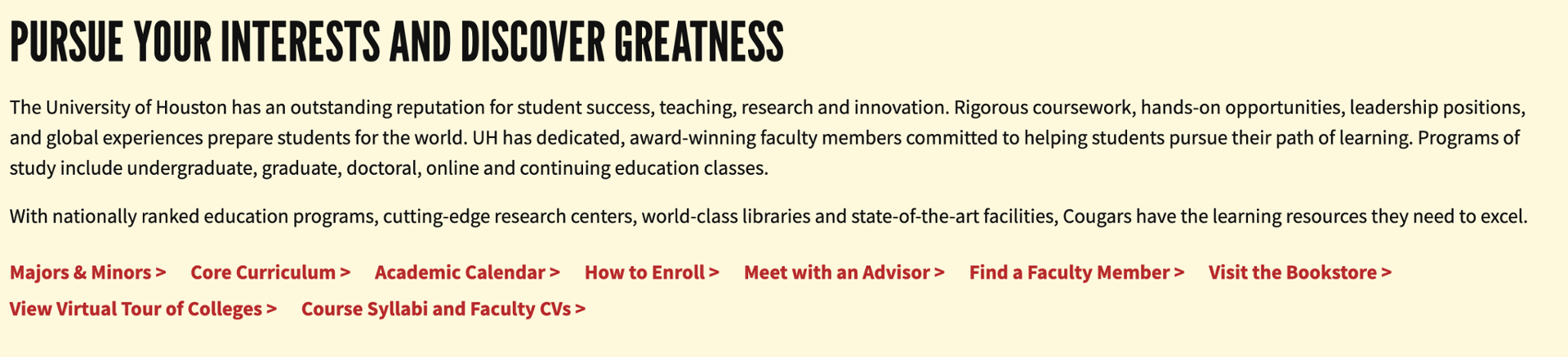
The CMS will provide the option of selecting the text to be displayed for the link (Link Text), and the option to select whether to link to an internal page or external URL.
Using Section Links without a WYSIWYG will produce hyperlinks next to the Section Heading, as seen below.

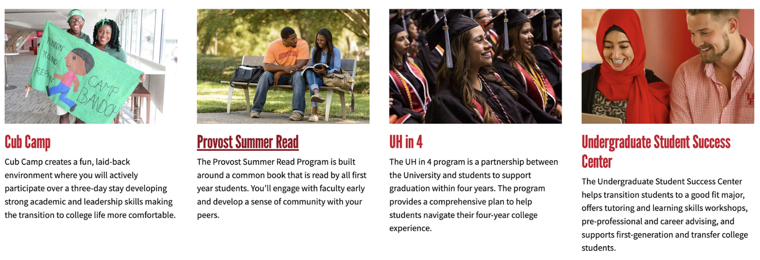
SPIFF Banks
A SPIFF Bank is a row of features containing an Image, Heading, Hyperlink, and Teaser Text. The number of Items Per Row can be set as either 2, 3, or 4, with 3 being the default. If six items are created and 3 is set for Items Per Row, a second row of features will be generated.
In the CMS, selecting a SPIFF Bank section will provide the option of selecting how many items will be displayed per row.
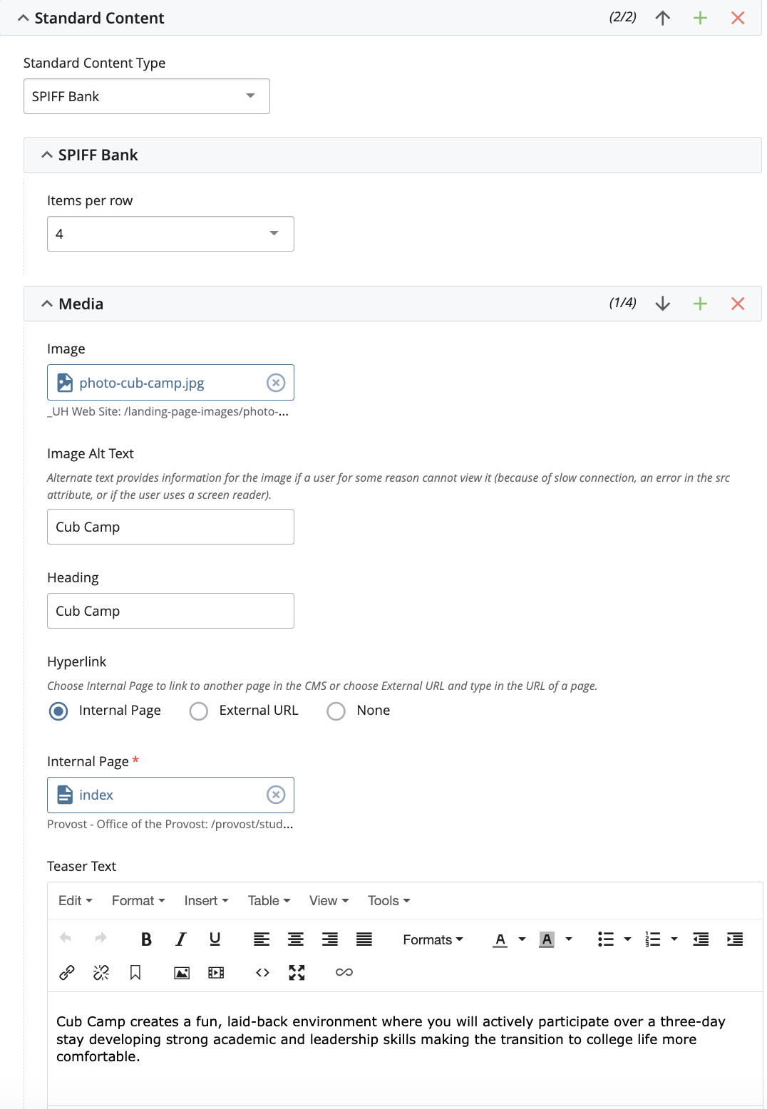
Following this, the option to add Media for each item is provided. Every Media item can also be given different specifications, like: alternate text, heading, hyperlink and teaser text. The teaser text will be the text displayed below the image and the hyperlink.
Carousel
A Carousel should be used for sets of items like a SPIFF Bank, but when the number of items is unpredictable. Carousels have the option of displaying between 1 and 6 items per row. Any extra items will be hidden, and only accessible by sliding on clicking on the arrow. We recommend the use of Carousel for news items, events, and other types of nonessential content that could potentially be hidden from the user. The below image shows a carousel that is on the UH News and Events site.

There are three options for Carousel Type: Features, Tiles, and Cards. All three display the same information but are formatted and styled differently. Features appear just like a SPIFF Bank. Tiles overlay the Heading and Teaser Text over the Image. Cards display the Heading and Teaser below the Image but aren’t styled as prominently as a Feature.
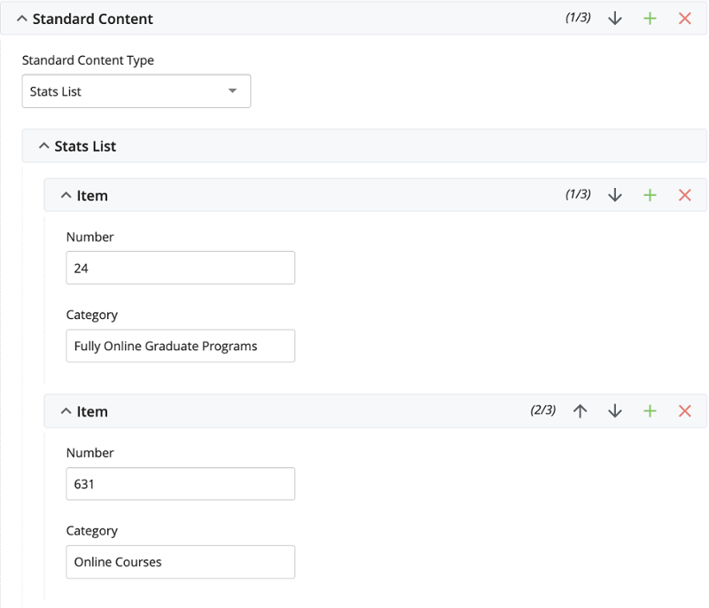
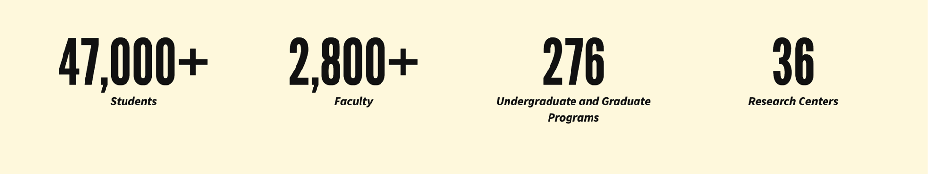
Stats List
A Stats List prominently displays numerical figures accompanied by a category. Any number of items can be used and they will automatically display in a grid. The list is built from left to right and top to bottom.
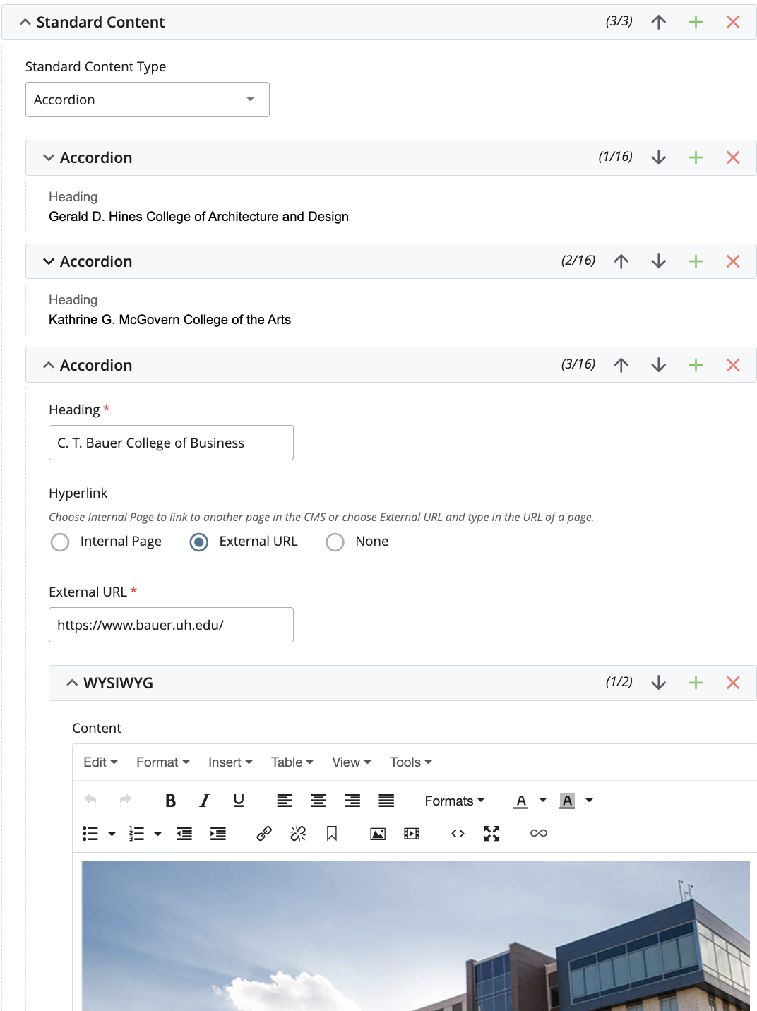
Accordion
The Accordion content type creates collapsible groups identified by its Heading. Headings can be hyperlinks or plain text. Buttons are placed before the Heading which controls the expand/collapse functionality of the Accordion.
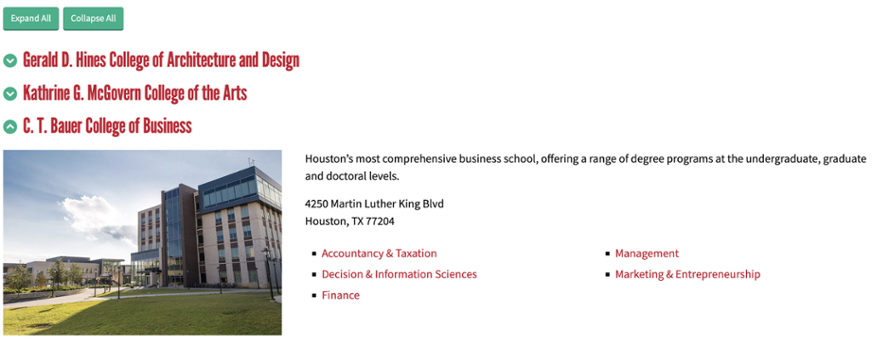
Within each accordion group is a WYSIWYG editor. Click the + icon next to each WYSIWYG editor to create multiple columns within an Accordion group. Control the size of the column with the Content Width dropdown.
Calendar Widget
The Calendar Widget will create a space to showcase events that have been added to a CMS calendar. The widget has the option of displaying the calendar as a list or in a carousel.
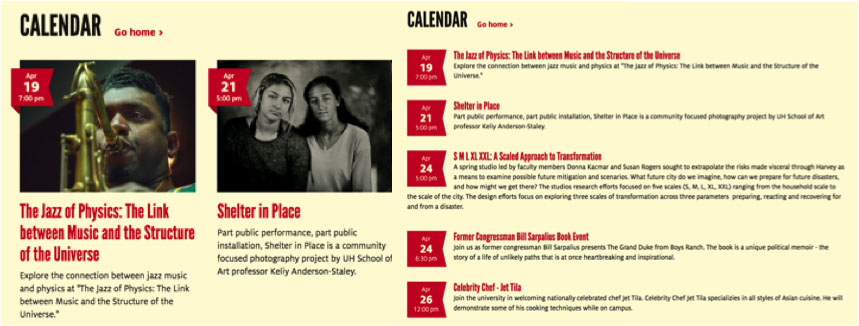
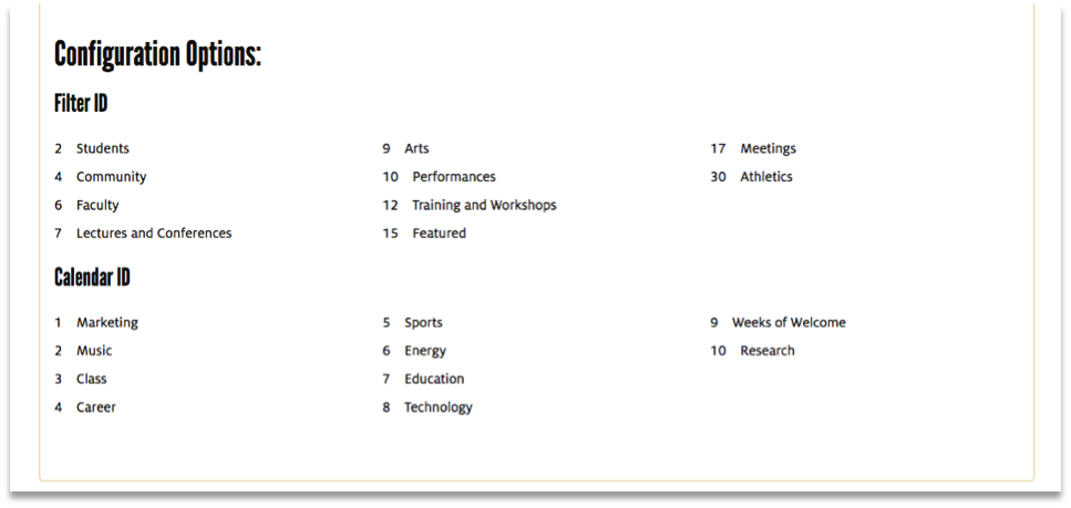
If not provided with a calendar page, the Calendar Widget will display information from the UH Main Calendar. Users have the option of adding Filter ID's and Content ID's to determine what events will be pulled from the main calendar. Below is a list of available ID's that can be used with the calendar widget.
Split Content
This section simply displays Standard Content on one side, with an image or video on the other side. To break up the repetitive nature of the Section Type, the option to reverse the columns is available.
The Split Content section will allow images, videos or playlists to be placed in the columns. The image shown above can be replicated selecting a Split Content section, followed by Section Links and then selecting what image to display, as well as column widths.
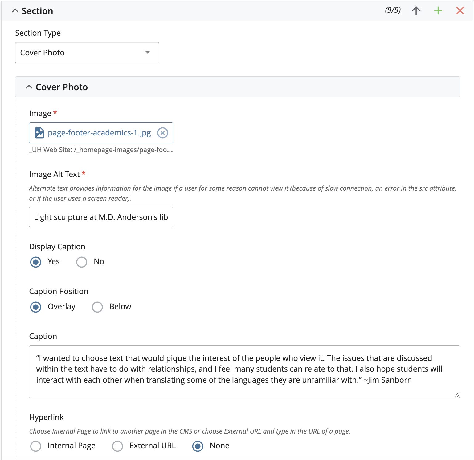
Cover Photo
A Cover Photo displays an image from edgetoedge of the page, with an optional Caption Text, and Hyperlink overlaid. The caption can be positioned on the the image (as seen below) or below it.
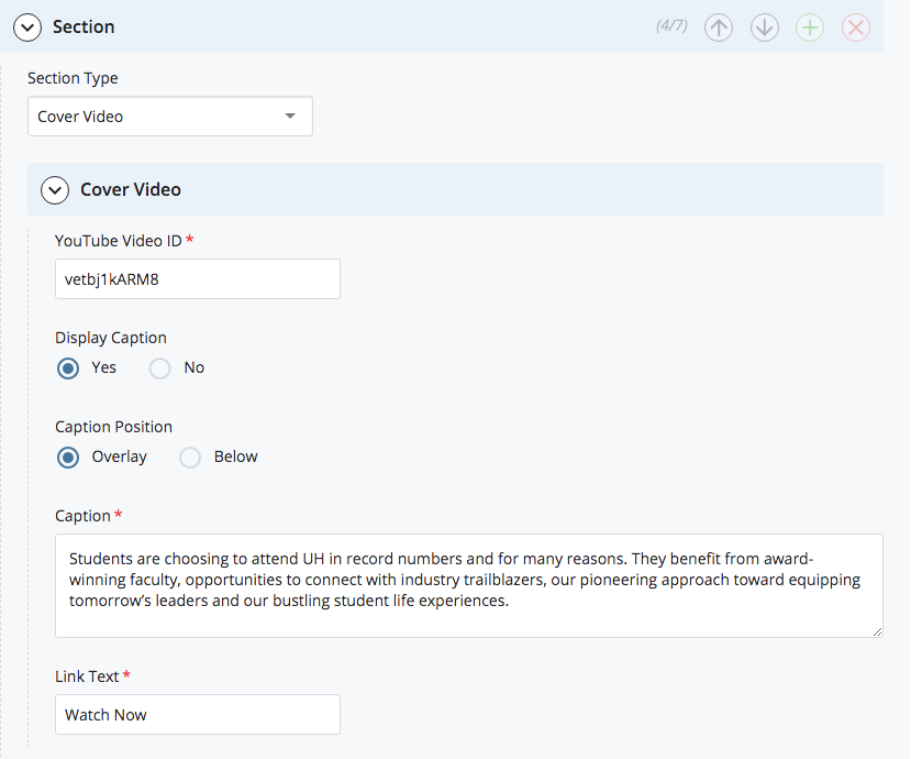
Cover Video
A Cover Video is exactly like a Cover Photo, but with a YouTube video instead of an image. When a caption is used, it will fade away when the visitor plays the video or clicks the Watch Now hyperlink. The YouTube Video ID will be the link to the Cover Video that will be played. The ID for any video can be found in the video’s URL, after the “=” sign in the browser’s address bar.
Example: https://www.youtube.com/watch?v=vetbj1kARM8 - Video ID bolded.
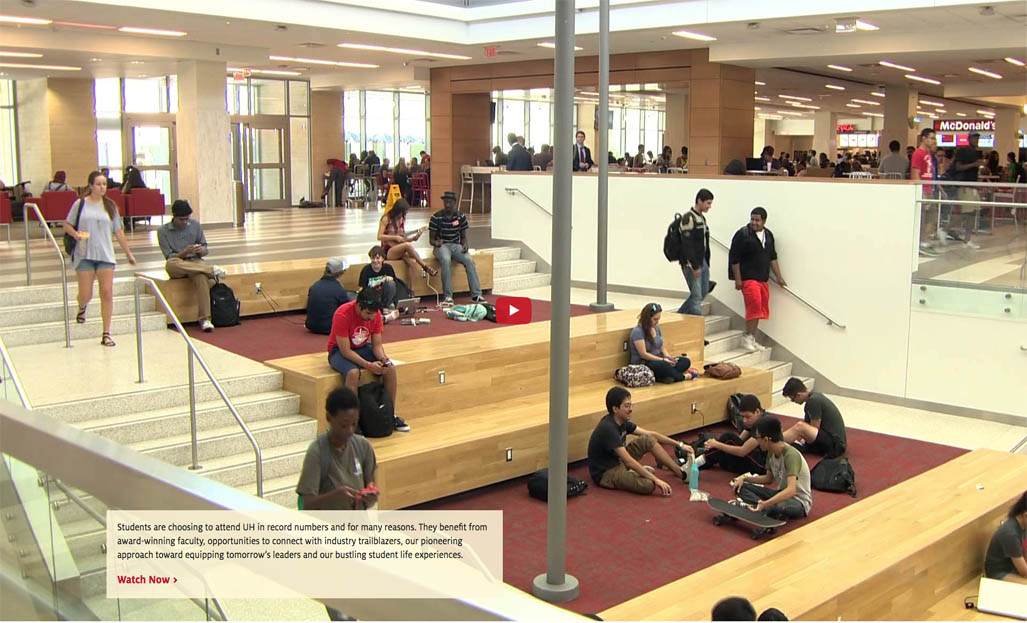
The CMS provides the option of adding a caption on the video, as an overlay or below it. The Link Text will behave as a Play Button when clicked.
Section Settings
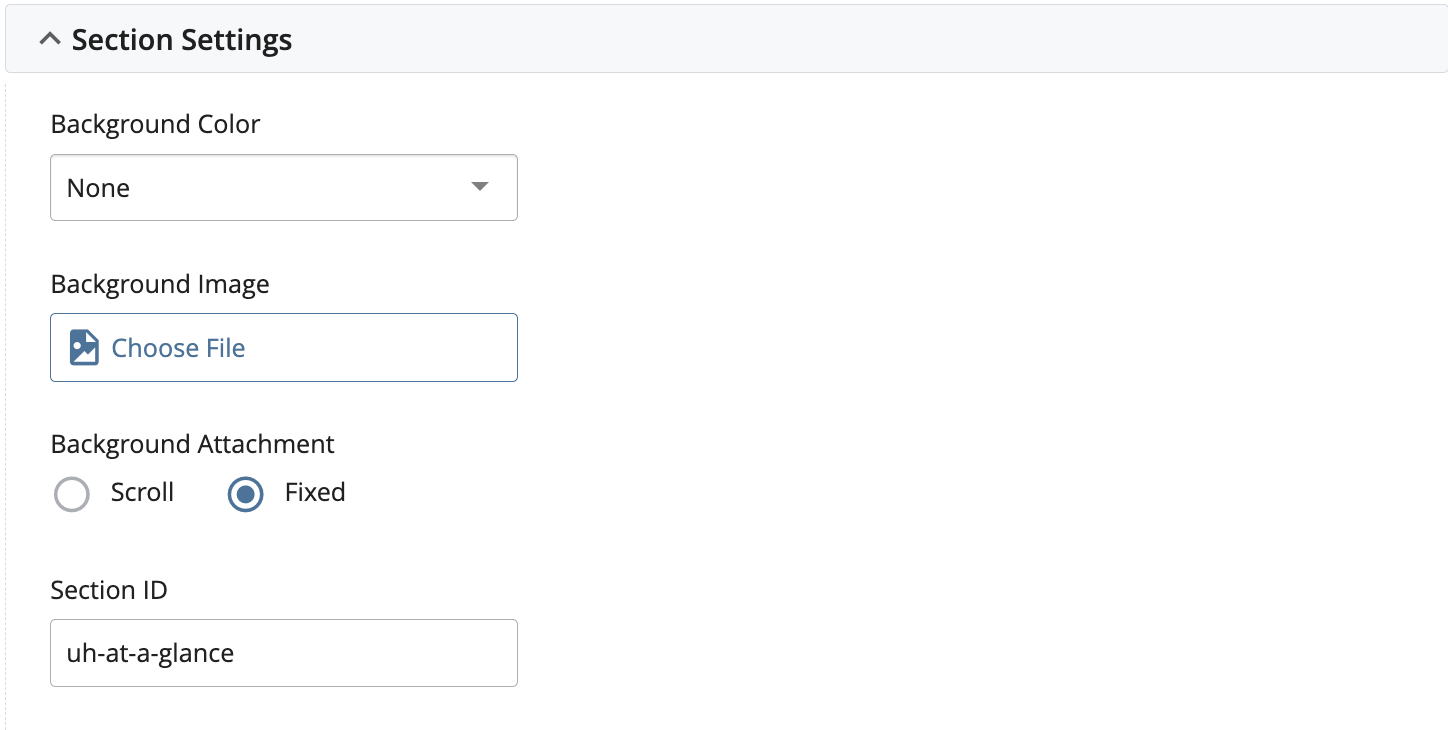
Each of the shown Sections can be assigned with a Background Color, Background Image, and Section ID. When a Background Color is set, foreground text and hyperlink colors are automatically changed to provide adequate contrast. When a Background Image is set, it is recommended that a Background Color is also chosen to match the image and provide adequate foreground contrast. Additionally, the Background Image can be set to be fixed which instead of scrolling with the content on the page, remains fixed and provides a parallax effect as the text scrolls over the background. Section ID can be assigned if On-Page Navigation is used, but can also be used to as a selector in custom CSS or JS files.
Page Settings
Every page within the CMS has Page Settings which provide different functionality. This interface also provides an option to disable breadcrumbs. The following figure shows the Page Settings interface for the CMS.
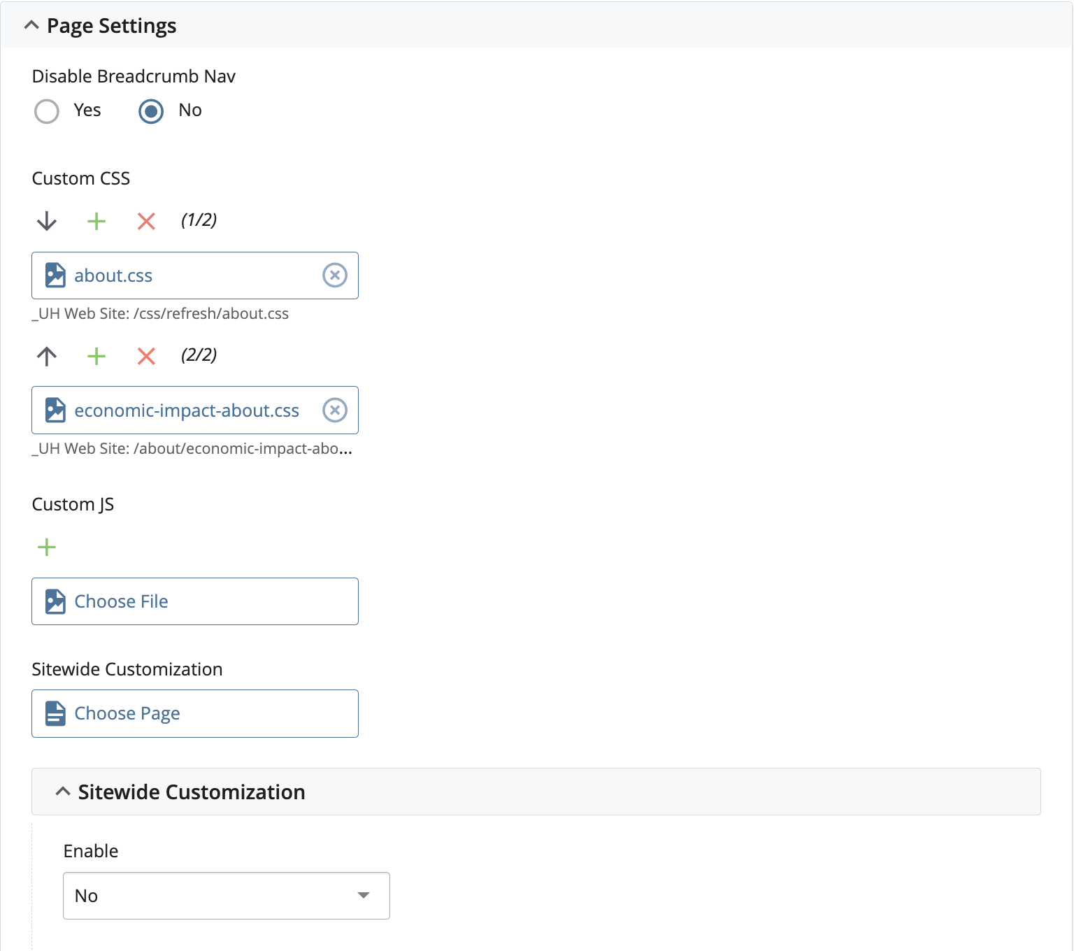
As noted above, the Page Settings will allow the inclusion of Custom CSS and JS, as well as enabling Site-wide Customization.
Site Settings
Site Settings allows the selection of any specific Headers and Footers for the page.
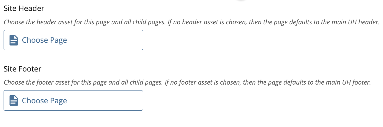
The default header is included for all pages that do not have a custom header. The same thing applies to the footer.
Note: Only those pages which are in the mechanical site-position of a homepage and which have the role/purpose of a homepage should have a header and/or footer chosen.
Related known issues: