placeholder

A Headline That's
Short—but Powerful

Lorem ipsum dolor sit amet, consectetur adipiscing elit, sed do eiusmod tempor incididunt ut labore et dolore magna aliqua.


The First actual "Section" - Read Me?

Landing pages give you many interesting design options. The Edit: Content panel is where you make your vision a reality; however, that may mean sorting through a lot of editing tools which may have lots of options and sub-options. This Section offers some practical and pragmatic tips on the Edit panel as a whole. Open each of these Accordion Collapsible areas to learn more.

This Section is built as an Accordion:
     Section (1): Standard Content: Accordion type

In a Landing-type page's Edit panel, the first content Section[s] per se will be found after the following:

  1. Page's primary Metadata is assigned (Title, Display Name, Description);
  2. Open Graph image option is reviewed (if there is no selection = defaults to a) any prominent image found in the page's content; or, b) the UH interlocking logo);
  3. Gateway Navigation option is reviewed (optionally adds a 'quick-links' bar which appears directly below the page's header via use of a Block asset; can be added at any time if wanted. If not wanted, disconnect the Block chooser);
  4. Page Header area is set up - or not (use of a top banner image is optional; red ribbon banner is also optional - leave Display Name empty and the red ribbon banner will not render);
  5. On-Page Navigation options are reviewed (Sections should exist first, and each Section must have a unique section-ID [think: all lower case text, no spaces, describes the section's content] assigned to it for these same-page-jumps to be created and to work correctly. NOTE: If the page's content sections are manually re-ordered, any relevant On-Page Navigation items will need to be similarly re-ordered.).
landing-edit-panel-top-items.png

One default content Section is provided as a starter kit for newly created Landing-type pages (e.g. from the Add Content menu). Each Section has its own sub-sets of multivarious content management options. Some common-type examples are included on this page so you can compare the page preview and the published page to the Edit panel setups. Visually, each Section may appear to be its own Row or horizontal band across the webpage.

You don't need as many Sections as you see on this page. Less than 5 Sections (aim for 1 to 3) makes it easier for your site visitors to appreciate your content. 

The Edit Panel will re-draw itself as you work: selecting options, adding and deleting segments, etc. Different options need different tools, which may not show until the option is selected. TIPS: Make note of which of multiple Sections you are currently working on (e.g. 3 of 7), so you can find it again and re-orient yourself quickly (and find the sub-sections you need more easily!). Close up any other Sections or sub-sections when you're not working on them at the moment. See also: Edit Panel - Working with 'Boxed Sets' how-to page.

Any content Section can be used to create new, separate content Sections. To create additional Sections, click on the green plus-sign from the top bar of any Section. By default, the new, "blank" section will appear directly below the Section used to create it. Once there are multiple Sections, re-ordering tools will become available to allow you to change the order in which they appear on the page: illustration showing item's rank in a set, re-ordering arrows, green plus sign for duplication, and delete icon red 'x'

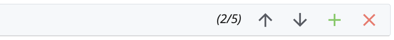
Each Section can have its own separate background color and/or image (optional). Color choices: None, Light Gray, Cream, Brick, Slate. Any background image chosen should not interfere with readability/accessibility of the content. The 'fixed' background option (content 'scrolls over' the fixed image) can add visual interest to the page if used judiciously. See Edit panel illustration of Section Settings options.

TIP: ask for a Marcom review if you're not sure how well your choices work visually vs for accessibility vs UHS/UH Brand - contact either webmarketing@uh.edu and/or branding@central.uh.edu for consultation. See also: Marcom's Web Style Guidelines for more about the UH Brand color palette.

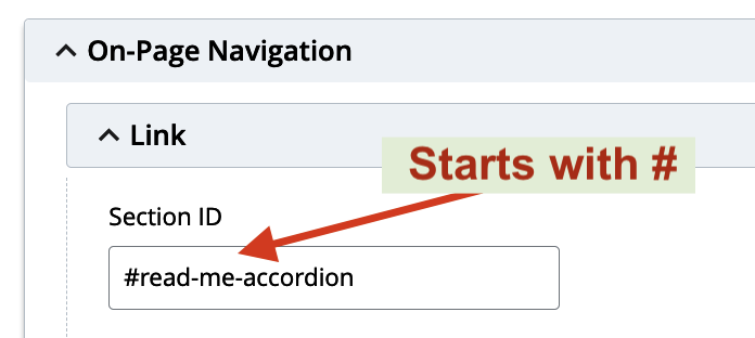
Each Section can have its own Section-ID (optional). A Section ID will be needed for any Section which participates in the On-Page Navigation option. Section IDs may also be used for leveraging custom CSS styles if desired.

If used on your page, the On-Page Navigation appears for your site visitors as they scroll down the page past the header, displaying at the top of the page in a Brick-colored band containing the same-page links. This page has an extraordinary number of sections, and the On-Page Navigation items take up more space on the page than usual, so you may need to scroll back up a bit to see the top of the material you're jumping to, if you are using a desktop monitor width screen.

ID TIPS: similar rules to system-naming conventions: case-sensitive, so easiest to keep them all-lowercase; NO SPACES; must be unique within the webpage's code. The ID text alone will be used in the Section's ID text field. Use the exactly matching ID text for the On-Page Navigation, but for the On-Page Navigation Link, put a "#" character at the start of the ID (again, NO SPACES here, either).
/infotech/services/web-services/cms/_landing-page-samples/on-page-navigation-link-section-id-2024-02-09.png  Illustration showing the ID field at the very bottom of a "Section" - ID text only, no #-mark

Page Settings
     TLDR: You can usually just leave these at the defaults, or simply unused.

The page's Breadcrumb subnavigation can be switched off for Landing-type pages; but please do not. Switching off the Breadcrumb obligates the page editor to provide alternate, similar navigation for the page, so site visitors aren't left stranded and unable to find the page's parent area[s], or parent subject matter.

The rest of the Page Settings options for a Landing-type page asset are similar to those of other pages, in that editors have the opportunity to associate custom CSS and/or JS for use by the page. Please be aware that custom CSS and JS are wholly optional, and may not be supported by the university, even if they fall within UH/UHS Brand. 

Landing-type pages also offer (similar to other "home-type" page assets) the ability to set up different ways of pushing styles to the entire site/area via override methods.

For help with deploying custom CSS, and/or CSS overrides, please contact webmarketing@uh.edu.


Header and Footer Chooser notes
     TLDR: You probably won't need these Choosers.

A Landing-type page will inherit the header and footer used by its parent area and will not need to have anything selected here for normal use. A Header and/or Footer should only be selected here if the page itself will be acting as the home page for its parent area. Otherwise, leave these disconnected, please. If header/footer inheritance does not seem to be working correctly in your site, please contact webmarketing@uh.edu for review and/or assistance.

Tags
     TLDR: not really an SEO tool, more of a Cascade-specific search aid.

The Cascade Tag selector/generator field is intended as a Cascade-internal search aid. Apply a tag to a page and then a Cascade Search can find it that way. Not SEO-related.

landing-whole-page-settings-2024-02-07.png

landing-edit-panel-header-footer-tags-2024-01-30.png

CONTENT: WHAT ARE YOUR CHOICES? SECTION TYPES

FYI: This Section was created using the Standard Content Type election, WYSIWYG sub-option. There are options here to create additional separate WYSIWYG areas, with each WYSIWYG getting its own piece of the row, but the basic single WYSIWYG flows across the whole row's width when set to the default "auto" percentage. 

Landing-page Section Content options and brief notes

Note that the Edit interface will change according to your selection, to give you the tools each option needs.

  1. Standard Content - and sub-types (see Edit panel illustration in a separate window):
    1. WYSIWYG Editor (default) 
      The basic fundamentals content option. Use as you would any WYSIWYG Editor / embedded HTML Editor.
    2. Section Links
      When a bold, simple link or series of links says it all.
    3. SPIFF Bank 
      Provides a row with one or multiple Special Interest Features. Each can have: picture, caption, blurb, link; (repeat.... )
    4. Carousel 
      Basically, SPIFF's with the potential to 'slide' - either: automatically; or when site visitor clicks an arrow; or not at all.
    5. Stats List 
      For bold, punchy stats meant to impress.
    6. Accordion 
      An outline-style content presentation which can have collapsible/expandable sub-sections.
    7. News List - contact webmarketing@uh.edu for more information.
    8. Calendar Widget 
      Pulls Calendar events from areas which use the Live Whale scheme. For assistance, contact webmarketing@uh.edu. Sub-options for how the content is presented:
      1. Carousel
      2. List

  2. Split Content - and sub-types:
    One side of the row will be an "image", the other side will be "content" - and the Editor decides which side is which, and what proportion each side gets (from pre-set percentage options). The "content" side has two (2) options:
    1. WYSIWYG Editor (content)
    2. Section Links (content)

  3. Cover Photo (no sub-types)
    Section can appear anywhere on the page. Often used as substitute for the built-in options for the top of the page, and/or at the bottom of a page as a finishing touch.

  4. Cover Video (no sub-types)
    Use may be similar to that of the Cover Photo option. For assistance, please contact webmarketing@uh.edu.

  5. Page Include (no sub-types)
    Pulls in a content-area from another page-type asset. Only use this if your area owns both page's content and/or controls the content's readiness for being live to the world wide web. Do not live-publish content pulled from pages which are not yet approved for live status.
     

SPIFF Bank Type Section - set for 3 items - Light or No Background

  • placeholder

    SPIFF 1 - Media 1

    Alterum facilisis expetendis vel eu, decore cotidieque mea an. Tale accusam eu nec, pri ut scaevola persecuti, modus interesset cu pro. Aperiam facilis consequat ut his. Et usu novum error tamquam. Usu no appetere rationibus. Eum id elit erat zril, sea at gubergren reformidans.

  • placeholder

    SPIFF 2 - Media 2

    Id vis omnis ubique minimum, no erat putant percipitur eam, nam iracundia adolescens in. Mea fabulas laoreet appetere id, duo ne aeque repudiandae. Ne usu adipisci reprimique, tempor mandamus qui an. Sea nibh iudico cu, alienum complectitur at vix. Iuvaret offendit per ei. Id has quas admodum suscipiantur.

  • placeholder

    SPIFF 3 - Media 3

    Id voluptua ocurreret sit, ius ei possit efficiendi, dicam ubique melius eos eu. Usu commodo molestiae ei, movet reformidans ad vix, cu facer instructior vim. His utroque dolores cu, eum eu nihil ocurreret incorrupte, nam wisi dolores delicata ex. Autem imperdiet sed et. Cum ea appareat recteque maiestatis, pri ad impetus omittantur.

SPIFF Bank Type Section - set for 4 items - with only 3 items built - Dark Background

  • placeholder

    SPIFF 1 - Media 1

    Vivamus eleifend imperdiet quam, at ultricies massa dictum ut. Etiam sollicitudin turpis et massa venenatis ultrices.

  • placeholder

    SPIFF 2 - Media 2

    Sed gravida massa quis fringilla luctus. Pellentesque placerat, ante et facilisis pellentesque, lacus velit viverra sapien, sit amet fermentum leo turpis sit amet diam.

  • placeholder

    SPIFF 3 - Media 3

    Sed rhoncus nisi est, et dapibus lectus fringilla vel. Phasellus sed bibendum odio. Vestibulum malesuada odio ut ex venenatis porta. Curabitur leo eros, dictum ac dapibus sit amet, posuere vel lorem. Nam a sapien augue.

SPIFF Bank Section - SVG Icons - 4 Media items

  • icon-cougar re-spelled without 'icon'

    Cougar SVG without "icon-" in Name

    This image was copied from the Cougar Icon SVG file, and the word 'icon' was removed from its system name. Compare how this SVG graphic acts when the background color for this section is changed, to the other Cougar Icon SVG.
  • Cougar Icon SVG with system name starting with "icon-"

    Cougar Icon SVG

    This image is an SVG graphics file (.svg file), transparent behind the black-line art, and its system name starts with "icon-" (so: icon-cougar-line.svg).  When the background for this Section is switched to a dark color, the black lines in the art switch to white lines automatically due to UH CSS styles.
  • two stacked books - SVG outline art - system name starts with "icon-"

    From EPS to SVG

    This is an icon of 2 books, one stacked on top of the other. The eps original was downloaded from images.uh.edu and taken into AI v.22, then Saved As an SVG.
  • FAQs Icon - speech bubble with question mark inside bubble

    FAQs Icon

    SVG images offer scalability and flexibility - great for responsive web designs. 


Carousel: Features option - 6 images per row, no sliding (autoplay 'off')

Stats List Type - with 'fixed' background image option

  • 1Section
  • 3+Items!
  • 3.14159Digits of Pi
  • 49Reasons
  • ALLin a line
  • 73Prime Examples
  • 0Calories

News List TEST

Calendar Notes (WYSIWYG)

Calendar Widget Sections need to publish (either Live/Production or Staging/Test in order to show the events. Inside Cascade CMS, the Calendar Widget Sections display only LiveWhale account information. However, that information can be useful in seeing potential selectable settings for the Widgets.

Filter No. Filter ID Calendar No. Calendar ID
2 Students 1 Marketing
4 Community 2 Music
6 Faculty 3 Class
7 Lectures and Conferences   4 Career
9 Arts 5 Sports
10 Performances 6 Energy
12 Training and Workshops 7 Education
15 Featured 8 Technology


Thumbnail Illustrations of the 2 Calendar Widget Styles:

Calendar Widget Carousel style  Calendar Widget List style

placeholder

A 'Split Content' Section

Split Content

This is a Split Content Type Section, one of the Standard Content options. One side of the row is an image, and the other side can be either WYSIWYG content, like this, or Section Links.

You can decide which side the image is on by using the 'Reverse Columns?' setting. This section is using the "Yes" option, which puts the image on the left side.

You can also select the proportion of space used for each side: 50:50 or 33:67. This section is using the 33:67 option, giving the image about one third of the row and the "content" the other two thirds.


"Standard Page Include"

This Content is being pulled from a remote page. Please be cautious about using this feature. Your area should either own or be responsible for the go-live readiness of both the remote page and the page pulling in the remote content.

To get a sense of what all is being pulled from this remote page, as well as what may not be being pulled, please visit this remote page.