The numbers are the ranks of the different events. That is, the 1992 event was the largest maximum annual discharge recorded in the data set. The 1993 event was the smallest event recorded.
Casual inspection of the plot suggests that the maximum annual discharge has tended to decrease since the records began in 1982.
This is the same plot that you looked at before the consecutive points were connected with straight line segments. This form nicely illustrates what happened at this guaging station for the 15 year time interval.
The maximum discharge event is given rank 1. The second largest event is given rank 2 and so on. Thus, with 15 ovservations, there will be 15 ranks and the smallest annual event has the largest numerical rank.
Note the following. From 1982 to 1986 rather large discharge events took place (2, 4, 5 and 6). The largest event (1) took place after three years of relatively small discharge events (12, 9 and 13).
The "jagged" nature of the time series suggests that it would be difficult (if not impossible) to accurately predict the magnitude of the maximum discharge event for 1997 given the fifteen years previous history.
However, there are some patterns that might be useful. Events 2 and 3 were separated by three years as were events 3 and 1. In the next section a method will be developed that looks at the rankings of the annual maximum discharge events. Our goal will be to develop a way to "predict" flooding.
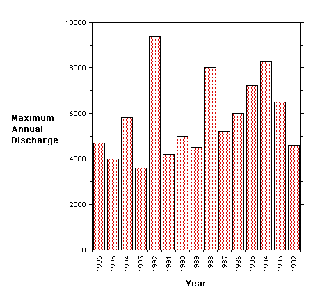
The histogram of the same data set is repeated below. Often there will alternative ways to display the same information.
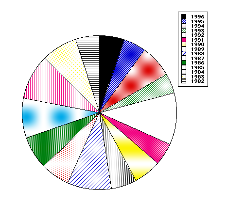
 Pie Diagrams provide another way to display information. A pie diagram for the same Diamond River data set follows. The width of each slice of pie (one year) is proportional to the discharge for that year. Which of the diagrams - X-Y plot, histogram, or pie diagram do you think "best" displays the information?
 Return